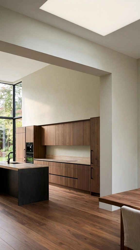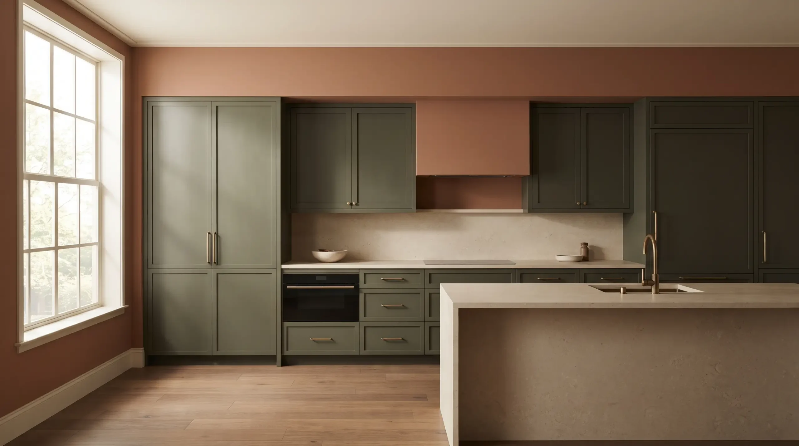
When homeowners ask what are the most popular kitchen paint colors, the short answer is that the palette has broadened significantly beyond stark, high-gloss white.
Today’s most sought-after kitchen wall colors lean heavily into tactile warmth, muted earthy tones, and sophisticated, restrained shades of green and blue.
The modern kitchen is increasingly treated as a lived-in living space rather than a sterile laboratory, driving a strong preference for warm neutrals, organic clay tones, and deeply saturated accents.
However, popularity alone does not determine whether a shade will succeed in your specific home. A paint color that looks ethereal and airy in a sun-drenched coastal property can turn muddy or cold in a compact urban apartment with limited northern exposure.
The way a hue behaves depends entirely on an interplay of factors: the angle and intensity of your natural light, the undertones in your cabinetry, the mineral movement in your countertops, your flooring material, and the overall room proportions.
This guide breaks down twelve of the most popular kitchen paint colors used by designers today, explaining not just what they are, but how they function in real-world spaces so you can find the right match for your layout.
1. Warm White
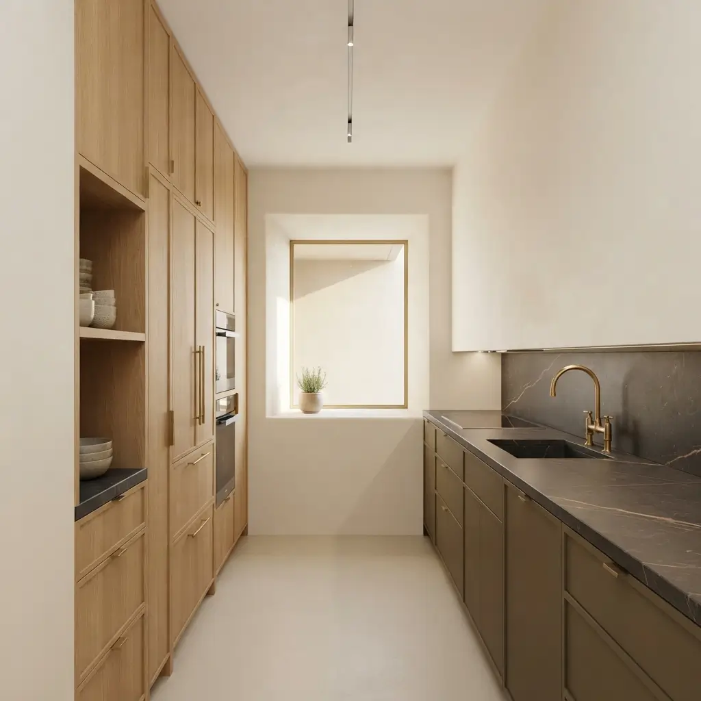
While stark, blue-based whites have taken a back seat, warmer whites remain an enduring staple. These shades feature subtle yellow, cream, or pink undertones that soften the overall atmosphere of the room.
A warm white wall color is particularly useful in kitchens featuring natural wood cabinetry, soapstone or warm-veined marble countertops, and unlacquered brass hardware.
Because it lacks the clinical edge of pure white, it absorbs soft artificial lighting and morning sun without appearing glaring.
It visually recedes, making it a reliable choice for smaller footprints where you want boundary walls to feel expansive without looking stark.
2. Soft Cream
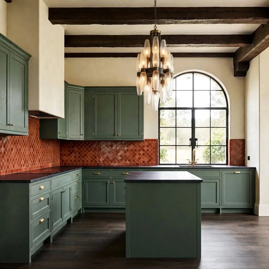
Moving a step past warm white, soft cream introduces a distinct vintage or collected character. Rather than feeling modern and minimalist, cream creates an inviting, buttery backdrop reminiscent of classic European farmhouses.
This shade works exceptionally well in traditional or transitional kitchens with heavily textured elements like handmade zellige tiles, oak flooring, and aged bronze fixtures.
In a kitchen with abundant natural south-facing light, cream can feel rich and buttery; in dimmer spaces, it provides a comforting glow that prevents the room from feeling neglected or cold.
3. Light Greige
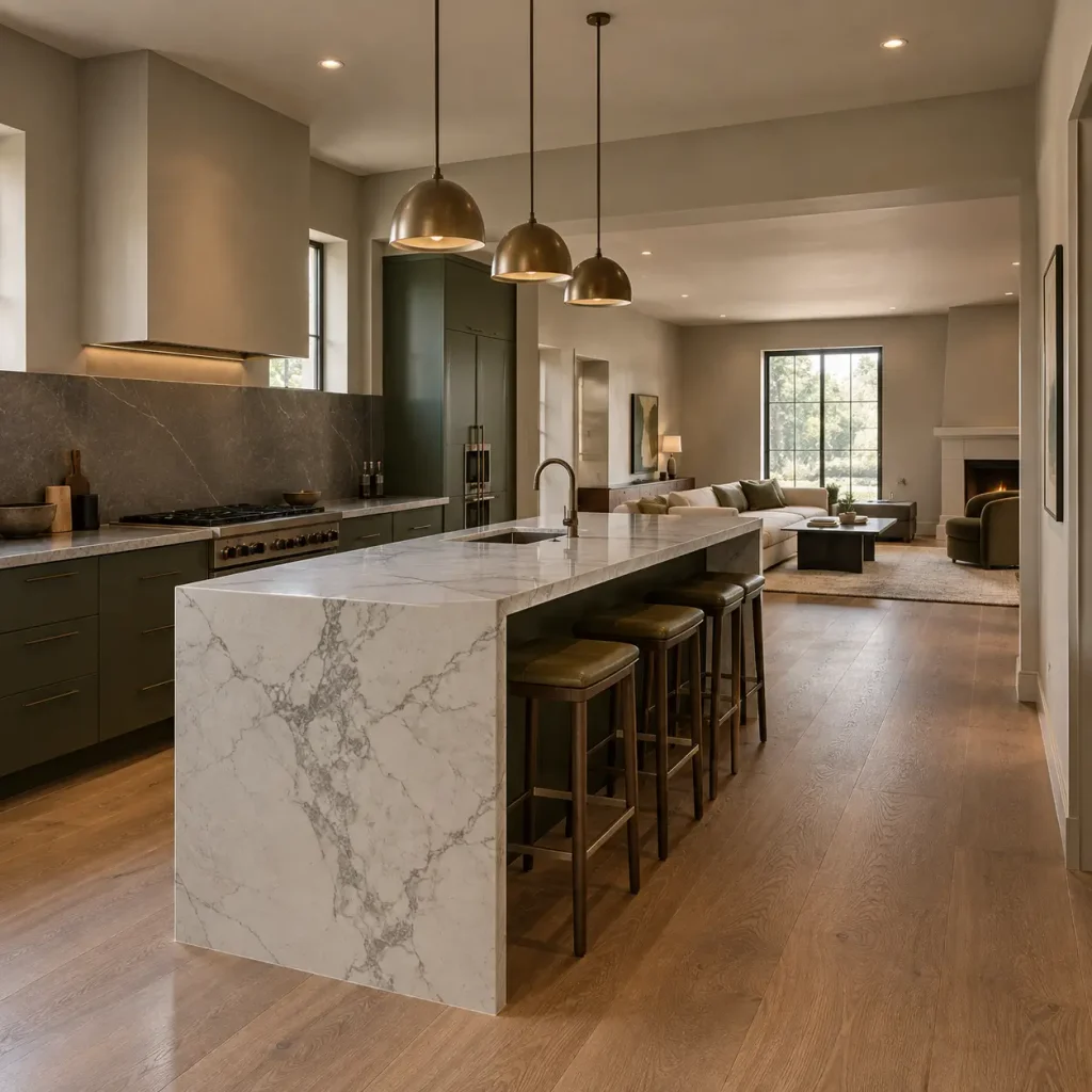
Greige – the well-documented hybrid of gray and beige, remains a dominant force in contemporary and transitional design. It bridges the gap between cool and warm, offering a neutral foundation that does not dictate the rest of your palette.
Light greige performs brilliantly in open-concept kitchens that flow into adjacent living areas, acting as a visual bridge. It pairs effortlessly with both gray-veined white quartz and darker charcoal countertops.
Pay close attention to its undertones: some greiges lean green under artificial LED lighting, while others lean taupe. Testing a large swatch against your specific cabinetry is essential.
4. Sage Green
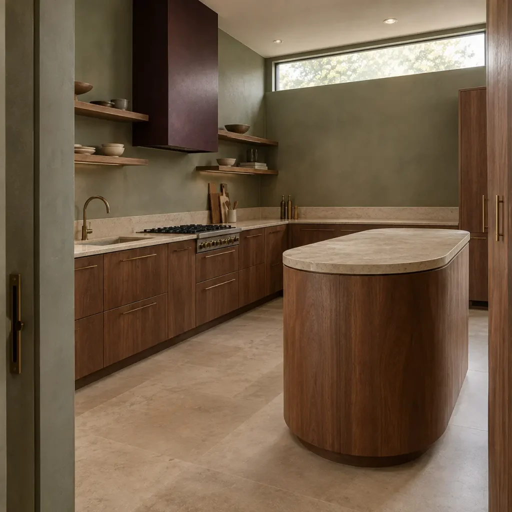
Green kitchen paint has cemented itself as a modern classic, and sage is among its most approachable iterations. This muted, dusty green introduces organic color without overwhelming the visual field.
Sage acts as a surprisingly versatile neutral. It complements white or cream upper cabinets, pairs wonderfully with white oak or walnut islands, and looks striking alongside honed marble or limestone.
Because it mimics foliage, it brings an organic, grounding energy to kitchens that lack a direct view of the outdoors. It works equally well as a full-room color or restricted to lower wall surfaces below open shelving.
5. Deep Green
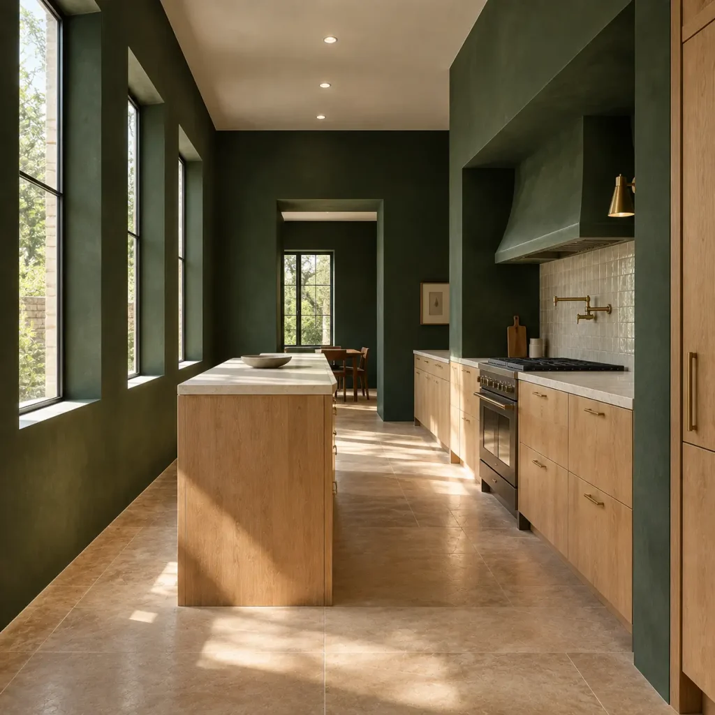
For those drawn to dramatic spaces, richer and deeper greens – ranging from pine to forest offer an alternative to standard black or navy. This hue provides a moody, cocooning atmosphere without feeling harsh.
Deep green demands careful consideration of light. In a bright kitchen with large windows, deep green walls absorb excess glare and create a sophisticated, tailored contrast against light oak floors and brass hardware.
In a windowless kitchen, however, it can quickly compress the room, making it better suited for well-lit spaces or as a targeted accent wall behind a range.
6. Dusty Blue
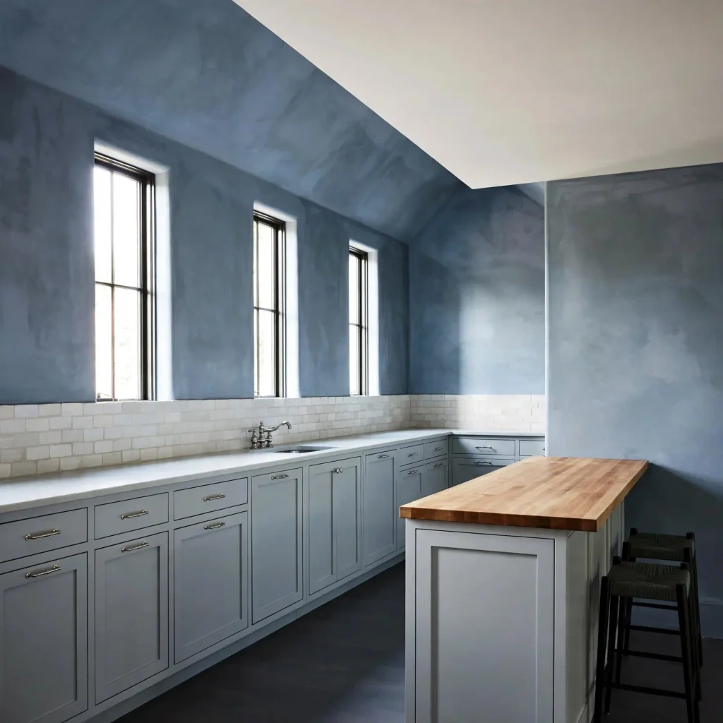
Soft, muted blue is a perennial favorite for introducing color while keeping the kitchen visually calm and airy. Unlike brighter primary blues, dusty blue carries a heavy gray or slate undertone that tones down its vibrancy.
This shade is a natural fit for cottage-style, coastal, or transitional kitchens. It pairs gracefully with crisp white or soft gray cabinetry, butcher block countertops, and polished nickel hardware.
Dusty blue tends to expand visual boundaries, making it a smart option for medium-sized kitchens that need a breath of fresh air without resorting to standard white walls.
7. Blue-Gray
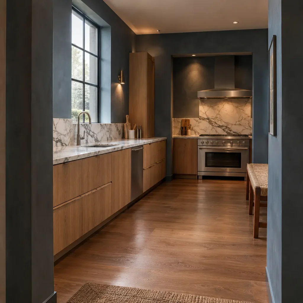
Sitting precisely between slate blue and charcoal gray, blue-gray is a chameleon color. Its appearance shifts dramatically throughout the day, reading as a cool, steely gray during overcast mornings and revealing its rich blue undertones under warm evening lighting.
This dynamic quality makes blue-gray ideal for contemporary spaces with mixed metal finishes or stainless steel appliances. It provides strong contrast against white marble or quartz countertops while anchoring the room.
Because of its cool disposition, it benefits from being paired with warm elements like woven barstools or hardwood flooring to keep the space from feeling clinical.
8. Warm Taupe
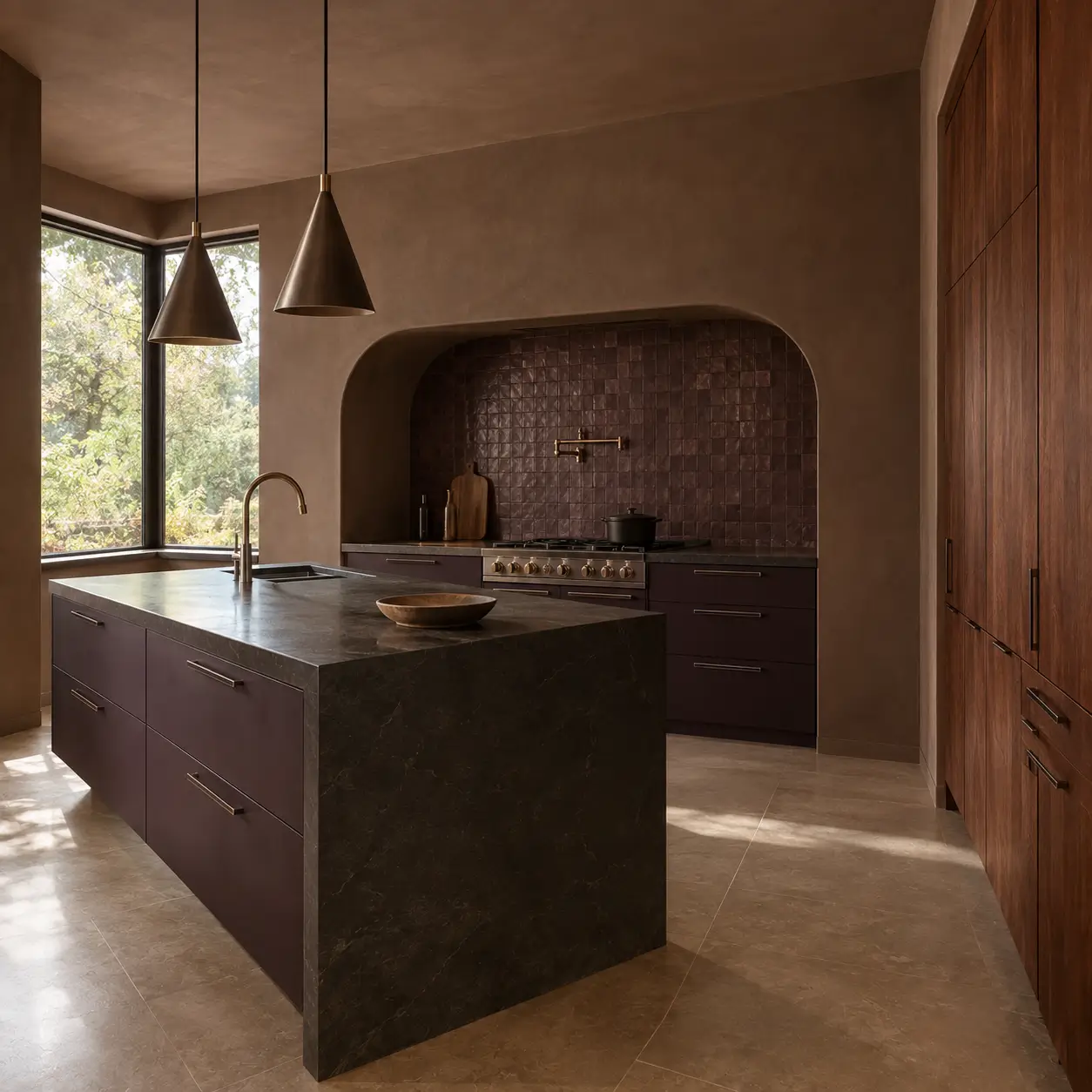
Taupe offers a sophisticated middle ground for homeowners who find standard beige too traditional and gray too cold.
By blending brown and gray with subtle red or violet undertones, warm taupe creates an enveloping, earthy backdrop.
This color excels in transitional and modern-organic kitchens. It looks exceptional alongside dark bronze hardware, black accents, and warm walnut or chestnut wood tones.
Warm taupe has a high light-absorption rate, meaning it creates an intimate, grounded atmosphere rather than a bright, airy one.
9. Charcoal
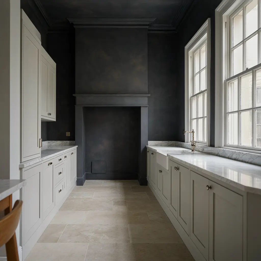
Charcoal is a deeper architectural option that brings instant modern gravity to a kitchen. It offers a softer alternative to true black, providing high contrast without the starkness.
Charcoal walls require careful balancing. They thrive in kitchens flooded with strong natural daylight or paired with crisp white perimeter cabinetry and light marble countertops.
When balanced correctly, charcoal adds undeniable depth and definition, framing cabinetry and architectural moldings with sharp clarity.
10. Muted Terracotta or Clay
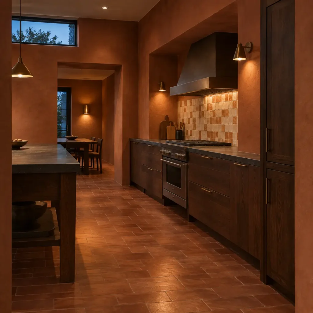
For readers searching for warmth and personality away from conventional neutrals, muted terracotta or clay provides an earthy, sun-baked alternative.
This hue brings warmth and historical depth, working beautifully in Spanish revival, Mediterranean, or eclectic modern kitchens.
It pairs exceptionally well with unlacquered brass, terracotta floor tiles, zellige backsplashes, and natural wood cabinetry.
Because it carries strong red-orange undertones, it transforms artificial lighting into a warm, inviting glow during evening hours.
11. Soft Black
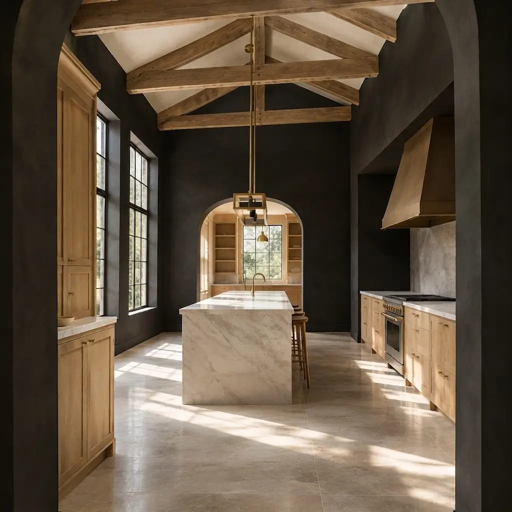
Near-black wall paint is a bold design choice that can yield stunning results when deployed with intention. Soft black absorbs light, making walls visually recede and creating a dramatic canvas for art, open shelving, or metallic fixtures.
Using soft black requires a careful evaluation of room size and lighting conditions. In a spacious kitchen with soaring ceilings and abundant natural light, black walls create a striking, intimate gallery effect.
In a small, dimly lit kitchen, however, it can overwhelm the space unless balanced by expansive white countertops and reflective surfaces.
12. Rich Navy
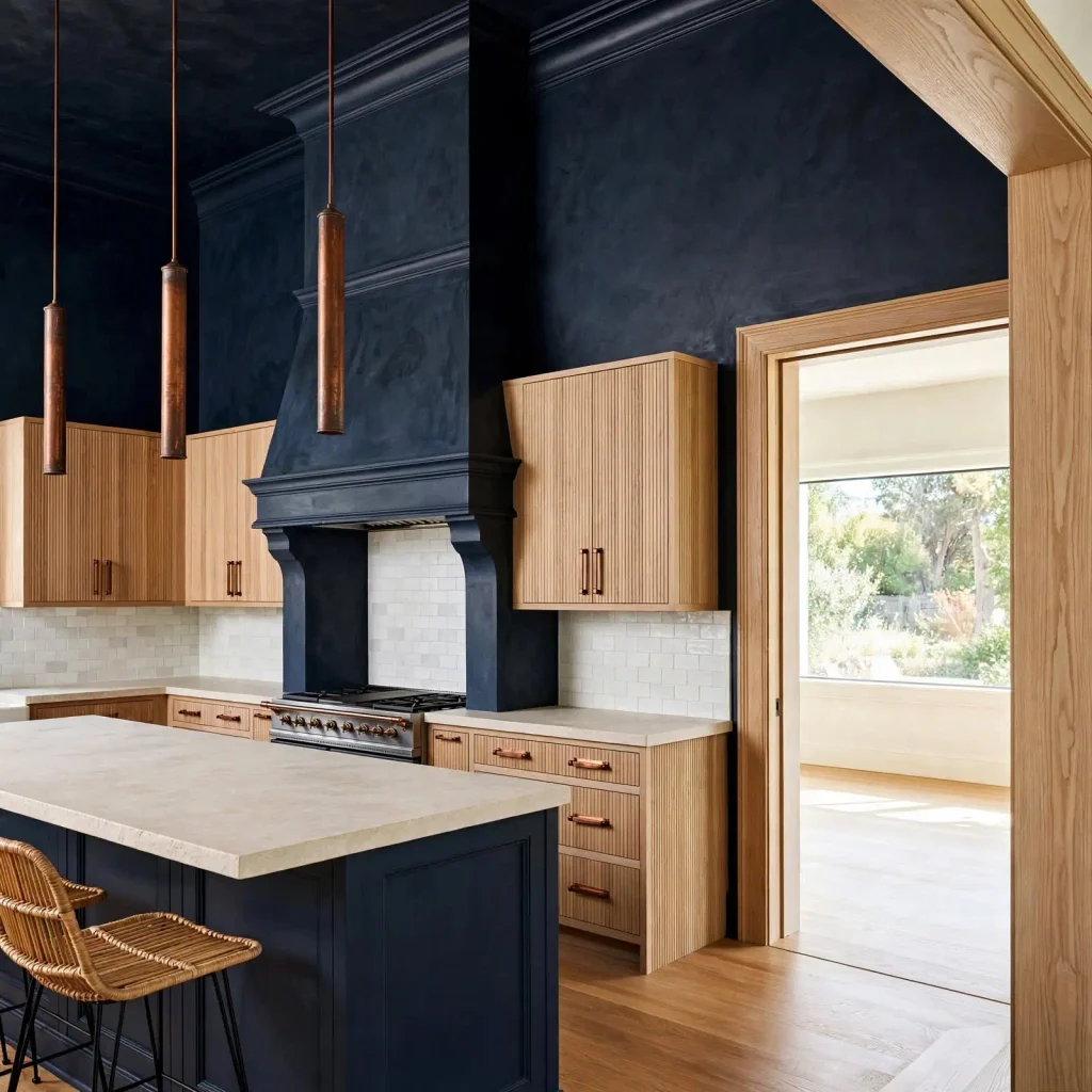
Navy blue remains a steadfast favorite in kitchen design, prized for its ability to anchor a room while providing a crisp contrast to surrounding finishes.
Navy works seamlessly alongside crisp white, soft cream, natural white oak, and warm metallic finishes like brass or copper.
It acts as a grounding anchor for large kitchen islands or perimeter walls, providing a tailored, nautical-leaning elegance that feels equally at home in traditional and transitional homes.
How to Choose Among the Most Popular Kitchen Paint Colors
Navigating kitchen color ideas requires looking at your existing fixed elements rather than evaluating a paint swatch in isolation. Here is how to narrow down your choices based on your current kitchen layout:
If Your Kitchen Has White Cabinets:
White cabinets give you considerable flexibility. Warm whites and creams can create a soft, layered look, while sage, dusty blue, navy, charcoal, and muted greens provide more noticeable contrast.
If the countertops are warm, a cool blue-gray wall may feel disconnected. Conversely, a warmer wall color can help tie creamy stone or wood flooring into the cabinetry.
If Your Kitchen Has Natural Wood Cabinets:
Look at the undertone of the wood before choosing paint. Pale oak often works beautifully with muted greens, soft whites, gentle blues, and warm grays. Walnut can handle deeper taupes, creams, sage, and richer earthy colors.
The goal is to complement the wood’s natural character rather than competing with it. A wall color that is too close to the cabinet’s undertone can make the entire room look flat.
If Your Kitchen Has Dark Cabinets:
With dark cabinetry, the wall can either soften the contrast or deliberately reinforce it. Warm white, cream, pale greige, and soft sage can lighten the overall composition.
For a more dramatic approach, a deeper green, navy, or charcoal can create a tonal kitchen where the cabinetry and walls feel intentionally related.
If Your Kitchen Gets Little Natural Light:
Pay close attention to undertones. Cool grays and blue-heavy colors can appear considerably colder under limited daylight, while warm whites, creams, taupes, and earthy shades may maintain more warmth.
That does not mean dark colors are automatically unsuitable. A small, dim kitchen can still accommodate a rich color when the surrounding finishes and artificial lighting are carefully considered.
If Your Kitchen Is Small:
A small kitchen does not automatically require white walls. What matters is visual continuity and the amount of contrast between major surfaces.
A moderately light sage, warm greige, soft cream, or dusty blue can provide color without creating too many competing boundaries. Keeping the ceiling and larger adjoining surfaces relatively quiet can also help the room feel cohesive.
If You Want a More Dramatic Kitchen:
Deep green, navy, charcoal, soft black, and muted terracotta can all create stronger character. Instead of treating a dark color as a statement for its own sake, consider what it is framing.
A charcoal wall behind pale cabinetry, for example, has a different effect from charcoal surrounding dark cabinetry.
Popular Kitchen Paint Colors and the Finishes They Pair With
Understanding how wall paint interacts with your primary kitchen finishes ensures a cohesive final composition:
White cabinetry: Works with almost the entire palette, from warm cream and greige to sage, navy, and charcoal. The cabinet’s exact white determines whether a wall should lean warm or cool.
Natural oak: Pairs especially well with warm white, sage, dusty blue, soft taupe, and earthy terracotta. These colors allow the grain to remain an important feature.
Walnut: Richer wood tones can handle cream, warm taupe, muted green, and deeper blue shades without becoming visually overwhelmed.
Marble or light stone: Soft whites, blue-grays, sage, navy, and charcoal can all work, depending on whether the stone has warm or cool veining.
Dark countertops: A lighter wall can soften the contrast, while a deeper color can create a more enveloping, tonal composition.
Brass hardware: Warm whites, creams, greens, taupes, navy, and terracotta naturally reinforce the warmth of brass.
Black hardware: Can provide a clean graphic detail against lighter neutrals or become part of a more dramatic palette with charcoal, navy, or deep green.
Stainless steel: Often works particularly well with cooler whites, blue-grays, dusty blues, charcoal, and balanced neutrals, although warm colors can create an intentional contrast.
Frequently Asked Questions
What is the most popular color for a kitchen right now?
There is no single color that works best for every kitchen. Cabinetry, lighting, countertops, flooring, and personal style all influence which popular shade makes sense in a particular room.
What kitchen colors are considered timeless?
Warm white, soft cream, restrained gray, taupe, muted blue, and certain deeper greens can remain adaptable over time because they work across multiple design styles. Their longevity depends partly on the specific undertone and the finishes surrounding them rather than the color name alone.
What paint colors work best with white kitchen cabinets?
Choose based on the cabinet’s undertone and the countertops, flooring, and lighting. Warm whites and earthy colors create softer transitions, while blues and deeper greens provide more deliberate contrast.
What kitchen paint colors work well in a dark kitchen?
Darker colors work when used intentionally, particularly if the room has adequate artificial lighting and lighter surrounding finishes.
Final Thoughts
The most popular kitchen paint colors offer plenty of inspiration, but popularity should be the beginning of the decision rather than the end of it.
The most important question is how a color interacts with the room you actually have. Look at your cabinetry, countertop undertones, flooring, natural light, hardware, and the amount of contrast already present.
A color that feels ordinary on a sample card can become remarkably effective when those elements come together. The best kitchen color is ultimately the one that makes the entire palette feel intentional.