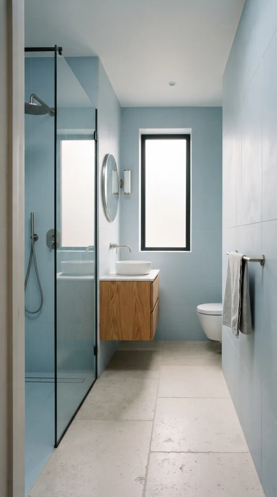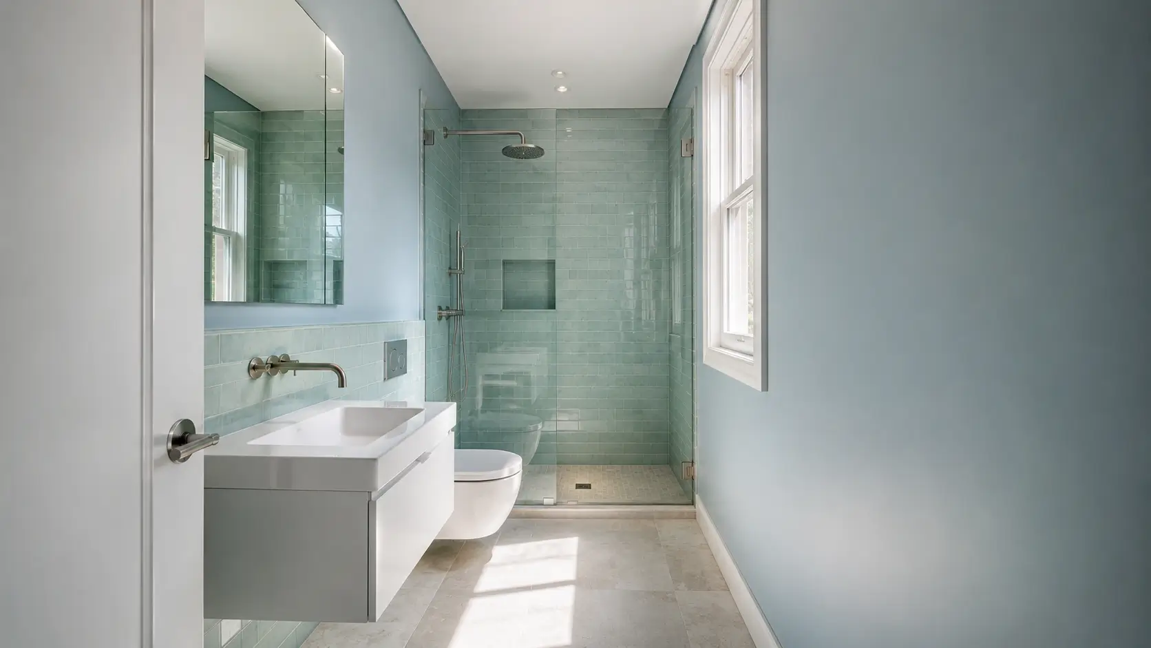
A small bathroom can feel cramped even when everything is clean, organized, and properly scaled. Color cannot physically add square footage, but it can change how the room’s boundaries, light, and surfaces are perceived.
That is why choosing among the best colors for small bathrooms is less about finding one magical shade and more about controlling visual weight.
So, which colors make a bathroom look bigger? Generally, lighter and softer colors can help reflect available light and create fewer visual interruptions, but the result also depends on undertones, contrast, tile, flooring, ceiling height, and artificial lighting.
A naturally bright bathroom can handle more color than a windowless powder room, while a darker floor may call for a lighter visual balance above it. The goal is not simply to make everything white.
It is to create enough continuity that the eye can move through the room without constantly stopping at hard color boundaries.
1. Soft White Creates a Bright, Continuous Backdrop
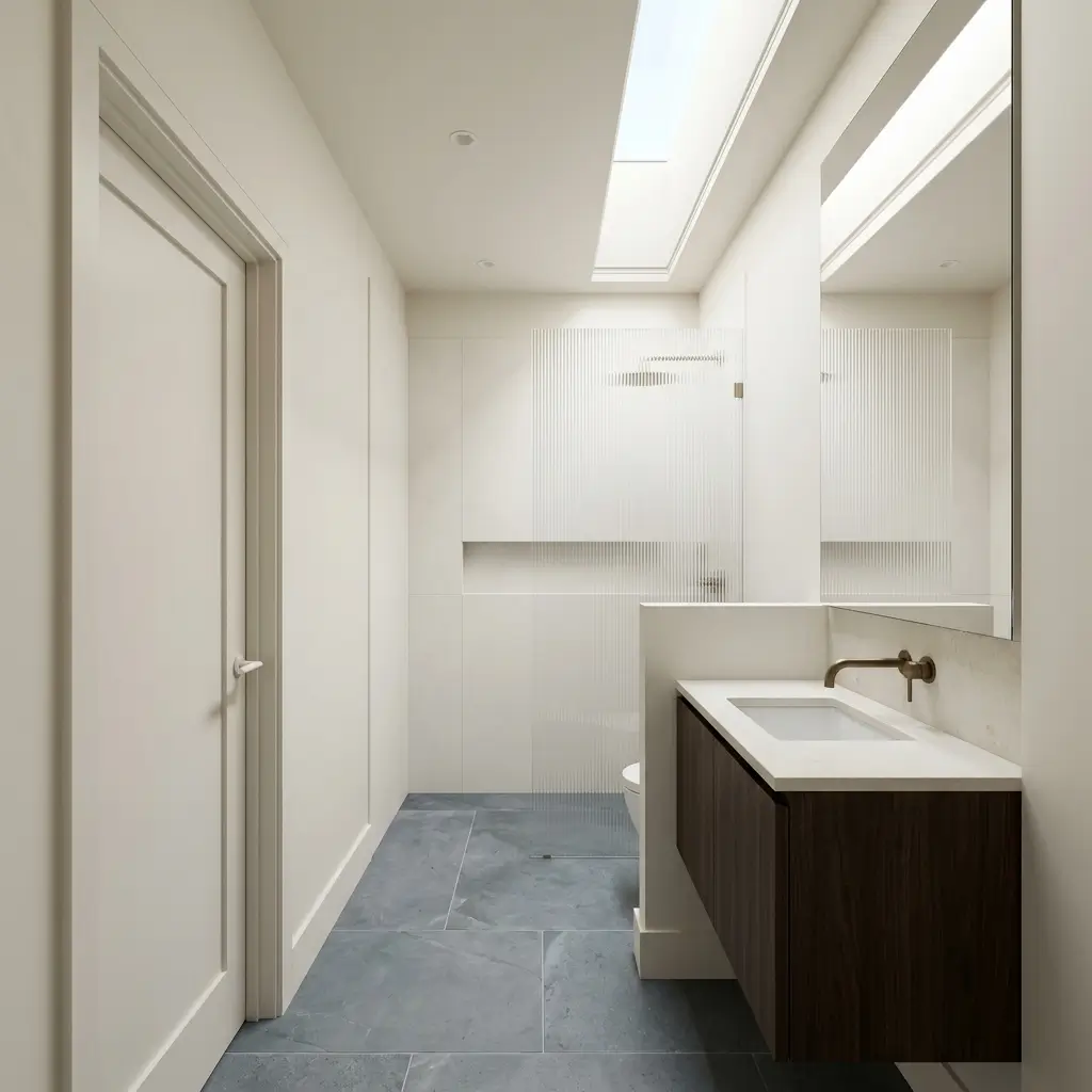
Soft white is one of the most reliable choices when a bathroom needs to feel more open, particularly when the room receives reasonable natural light. Unlike an extremely stark white, a slightly warm or softened white can make the space feel brighter without creating a cold, clinical appearance.
The important distinction is undertone. A white with a subtle warm base can work beautifully with natural wood, aged brass, limestone, or warm-toned flooring. In a bathroom with cool gray tile and chrome fixtures, a cleaner white may feel more cohesive.
Consider using the same soft white on the walls and trim, then allowing the vanity or flooring to provide the contrast. That uninterrupted background can make corners feel less visually abrupt.
2. Pale Blue Adds Color Without Heavy Visual Weight
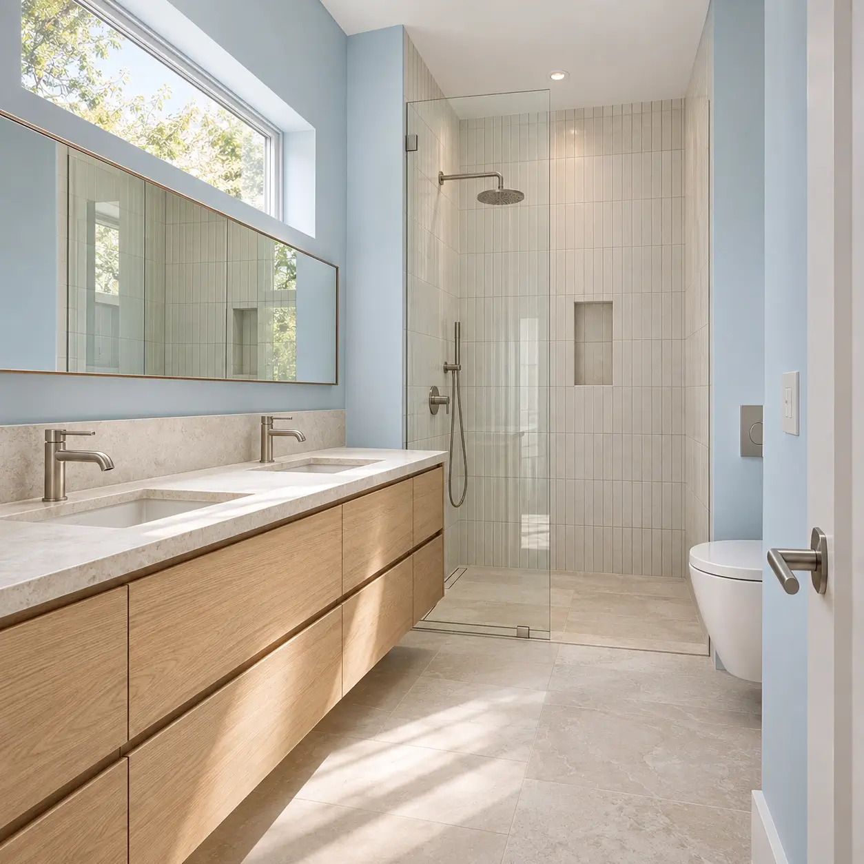
A very light blue can make a compact bathroom feel airy while introducing more personality than an all-white scheme. The trick is choosing a muted blue rather than an intense or highly saturated shade.
Pale blue works especially well in bathrooms with daylight because natural light can bring out its subtle freshness. Pair it with white tile, pale oak, or light stone to keep the overall composition open.
For a bathroom with limited natural light, look for a blue with a slightly softened or warm undertone. A heavily gray-blue shade can appear dull under weak artificial lighting.
3. Light Sage Green Brings Soft Contrast
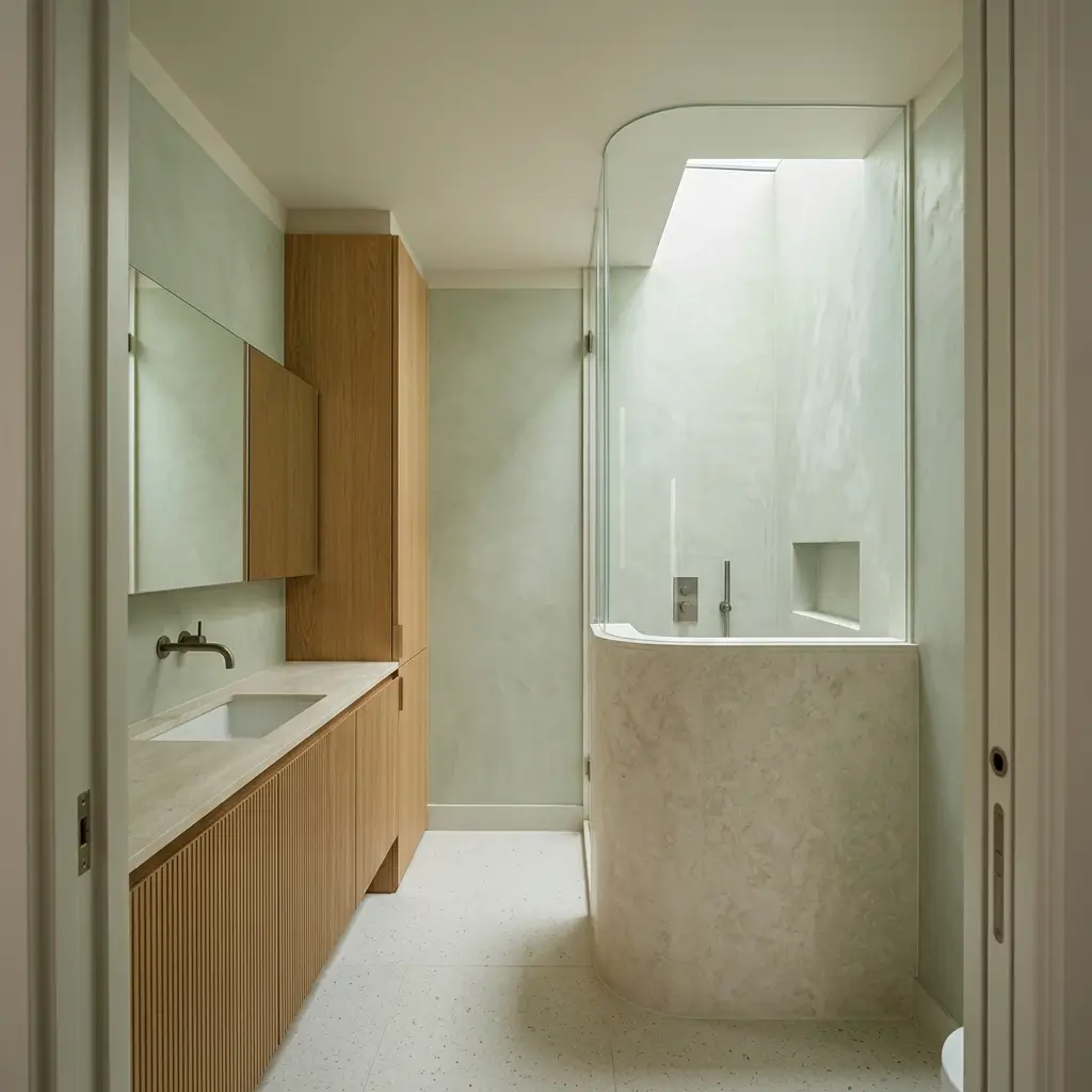
Light sage is useful when you want color without creating a strong visual boundary. Its muted quality allows it to sit comfortably against white, cream, natural wood, and stone.
In a small bathroom, sage can work particularly well across the walls while the ceiling and trim remain a related light tone. This creates color without dividing the room into sharply contrasting sections.
It also suits bathrooms with natural materials, where a small oak vanity, stone countertop, or woven accessories can reinforce the connection to the muted green. In a windowless room, test the paint under the bathroom’s actual lighting first; some sage shades become considerably grayer once daylight disappears.
4. Warm Greige Gives a Small Bathroom More Depth
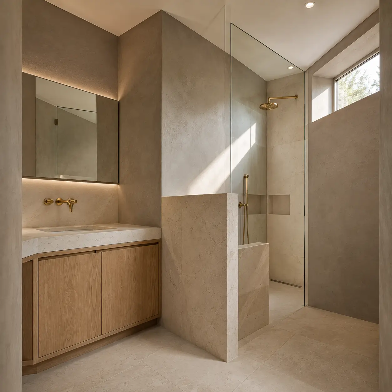
A light greige can be a smart alternative when white feels too stark but a darker neutral would add too much visual weight. Its combination of gray and beige undertones gives the walls enough definition to feel intentional without creating a heavy backdrop.
Warm greige works especially well with warm white tile, light oak cabinetry, brushed brass, and natural stone.
The key is keeping the contrast controlled. A pale greige wall beside dramatically dark tile can create separate visual blocks. A closer relationship between wall, tile, and trim tends to produce a calmer, more continuous effect.
5. Pale Gray Works Best When the Lighting Supports It
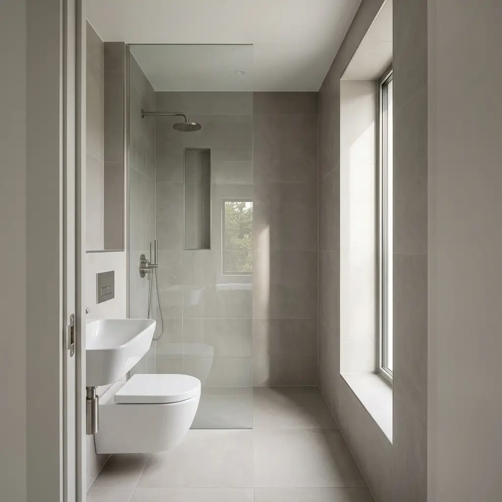
Pale gray can make a bathroom feel spacious, but it is more dependent on lighting than many warmer colors. In a room with generous daylight, a soft gray can provide subtle definition while keeping the walls visually light.
In a bathroom with a small window, choose a gray carefully. Blue or violet undertones can become more pronounced under cool LED bulbs, making the room feel darker or colder than expected.
A warm pale gray paired with white surfaces can be more forgiving in low light. Matte porcelain tile, simple white fixtures, and restrained contrast can keep the palette from becoming visually fragmented.
6. Soft Cream Warms Up a Small Bathroom
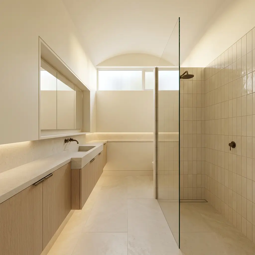
Cream is useful when you want the brightness of a light palette without the sharper appearance of pure white. Warm artificial lighting can make creamy walls especially inviting, while daylight keeps them from feeling overly yellow when the undertone is restrained.
Use cream with ivory tile, light natural wood, or muted stone for a gentle tonal scheme. The closer these surfaces are in value, the less the eye is forced to process separate blocks of color.
Cream may be less successful when paired with very cool gray tile or icy blue fixtures because the undertones can compete. The finishes need to belong to the same temperature family.
7. Blush or Dusty Pink Adds Personality Gently
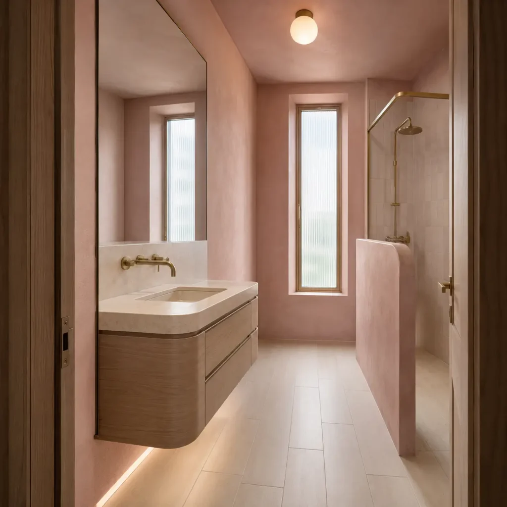
A muted blush or dusty pink can work surprisingly well in a small bathroom when it is treated as a soft background rather than a statement color.
Unlike a vivid pink, a dusty version has enough gray or earthy influence to keep the walls visually quiet. It can complement creamy white, pale stone, warm wood, and brushed brass without overwhelming a compact room.
This approach suits powder rooms particularly well, where you can introduce a more distinctive color while keeping the fixtures and surfaces relatively simple. If the bathroom is already visually busy, however, a restrained neutral may provide better continuity.
8. Light Taupe Can Make Surfaces Feel Connected
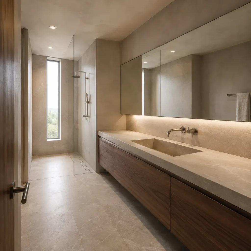
Light taupe sits between beige and gray, making it useful when several existing finishes already have warm neutral undertones. Rather than drawing attention to the walls, a pale taupe can help them visually connect with flooring, cabinetry, and stone.
This is particularly effective when the bathroom contains several materials that are close in tone. Instead of creating strong boundaries between each finish, a coordinated taupe-based palette allows the eye to read the room more as one composition.
Avoid choosing taupe simply because it is light. Some taupes are considerably deeper than they appear on a small paint chip, especially in rooms with weak lighting.
9. Muted Blue-Gray Offers Subtle Definition
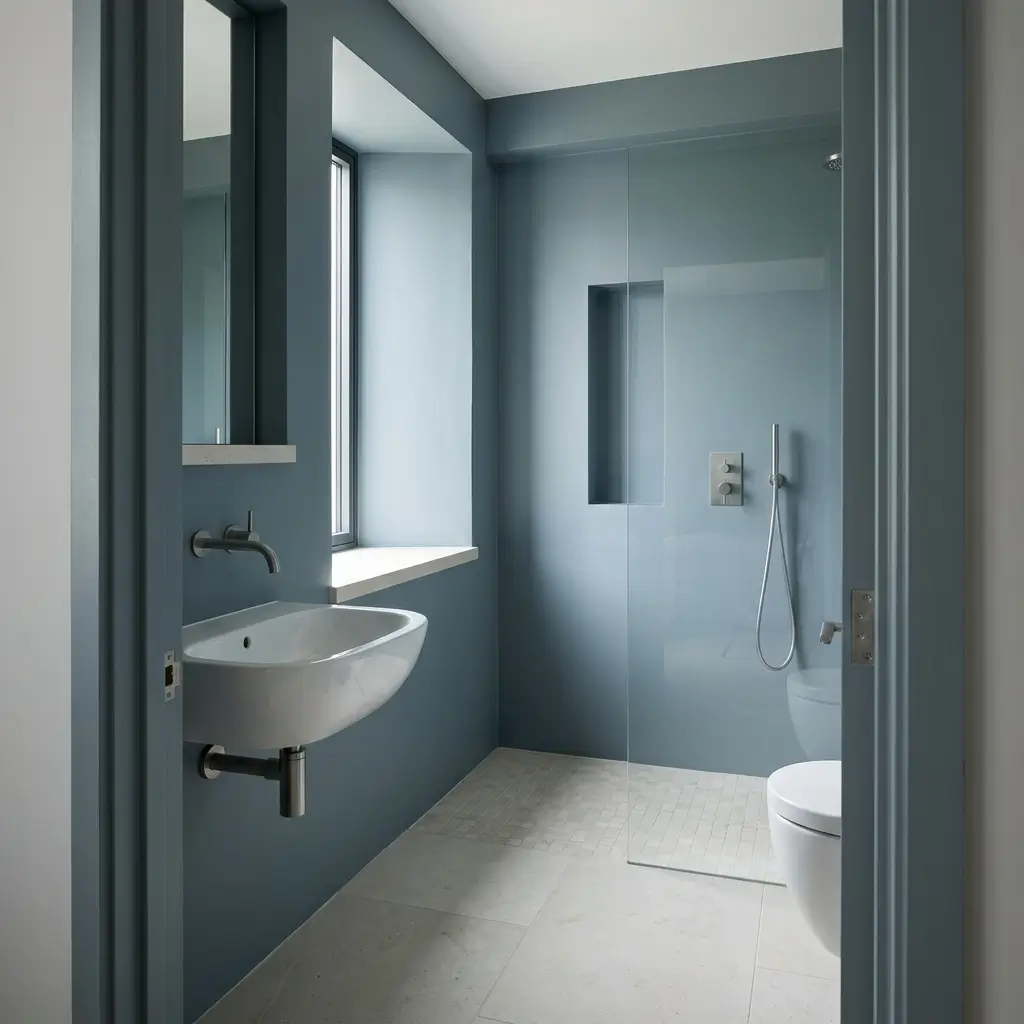
If completely pale walls feel flat, a muted blue-gray can introduce gentle contrast while remaining visually restrained.
This shade is especially effective with white sanitaryware, pale flooring, and chrome or brushed-metal fixtures. It can give the bathroom more architectural character without requiring a dramatic accent wall.
Because blue-gray can shift noticeably according to lighting, sample it beside the actual tile and flooring. A shade that looks soft and airy in daylight may appear significantly cooler under artificial light.
10. Pale Mushroom Creates Warmth Without Going Beige
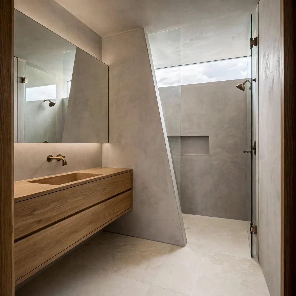
Pale mushroom is an earthy neutral with enough gray to keep it contemporary and enough warmth to prevent the room from feeling stark.
It can work well with ivory, natural stone, medium wood, and aged metal finishes. In a bathroom with modest natural light, the warmth can also prevent the walls from appearing flat or lifeless.
The strongest application is usually tonal rather than high-contrast. Let the mushroom color connect visually with the tile or vanity instead of surrounding it with several unrelated colors.
11. Carry One Color Across More Than Just the Walls
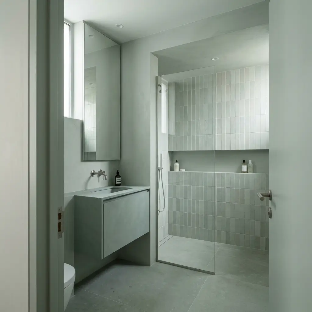
Paint color is only one part of the equation. If the walls are light but the tile, trim, cabinetry, and shower surround all introduce sharply different colors, the bathroom can still feel visually chopped up.
Carrying a similar color family across multiple surfaces creates continuity. For example, soft white walls can meet warm-white shower tile, a pale stone floor, and an ivory vanity without each element demanding separate attention.
This does not mean everything must match exactly. Small differences in texture and finish can provide interest while the color relationships remain close.
12. Bring the Ceiling Closer to the Wall Color
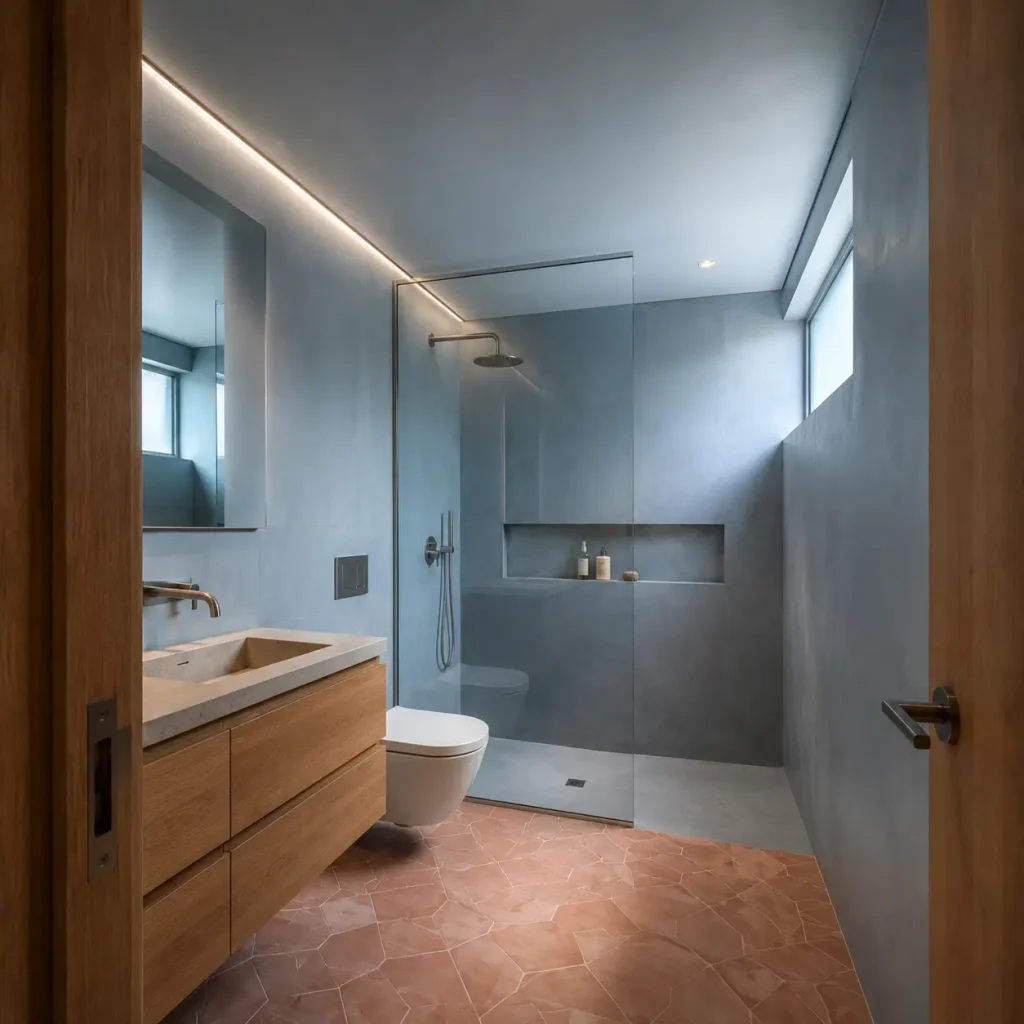
A strong line between a light wall and a dramatically different ceiling can emphasize the ceiling’s boundary. In a bathroom with low ceilings, using a ceiling color that is close to the wall color can make that transition less noticeable.
The result is subtle, but that is the point. Instead of the eye stopping at the wall-ceiling junction, the surfaces read more continuously.
A related ceiling color can work with both white and colored walls. For example, a pale blue wall paired with a very soft blue-white ceiling can feel more connected than pale blue beside a stark, contrasting ceiling.
13. Keep Tile and Wall Colors Relatively Close
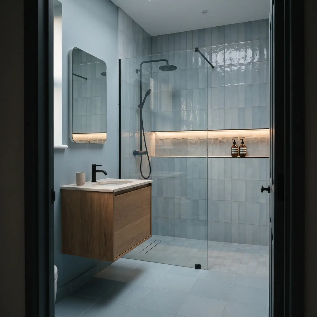
Tile can have as much influence on perceived spaciousness as paint. A small bathroom with pale walls but dramatically contrasting dark tile may look more divided because the eye registers the floor, walls, and shower area as separate blocks.
Keeping the wall and tile colors relatively close can soften those divisions.
You can still create interest through shape, texture, grout lines, or finish. A handmade-look cream tile against a slightly warmer cream wall, for example, can have considerably more visual character than a completely flat surface while maintaining color continuity.
14. Use Darker Colors as Anchors
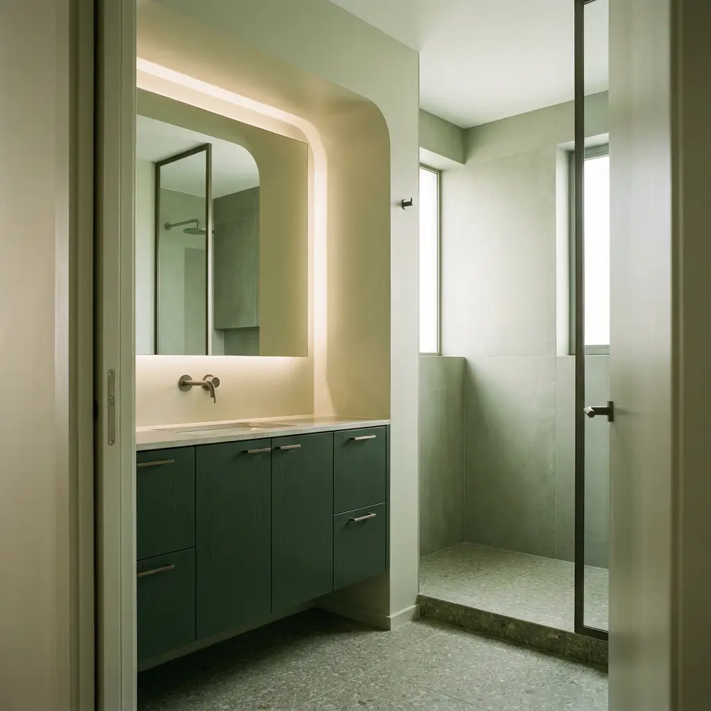
Dark colors are not automatically wrong for small bathrooms. The issue is usually how much visual weight they occupy and how sharply they contrast with surrounding surfaces.
A deep green vanity beneath pale sage walls, a charcoal lower cabinet beneath a soft white backdrop, or a darker shower niche can add depth without making the entire room feel closed in.
This works because the darker element has a defined role. It gives the eye somewhere to land while the larger surfaces remain visually lighter and more continuous.
A useful rule is to decide what you want the darker color to emphasize rather than using it simply for contrast.
15. Let Contrast Do Less Work
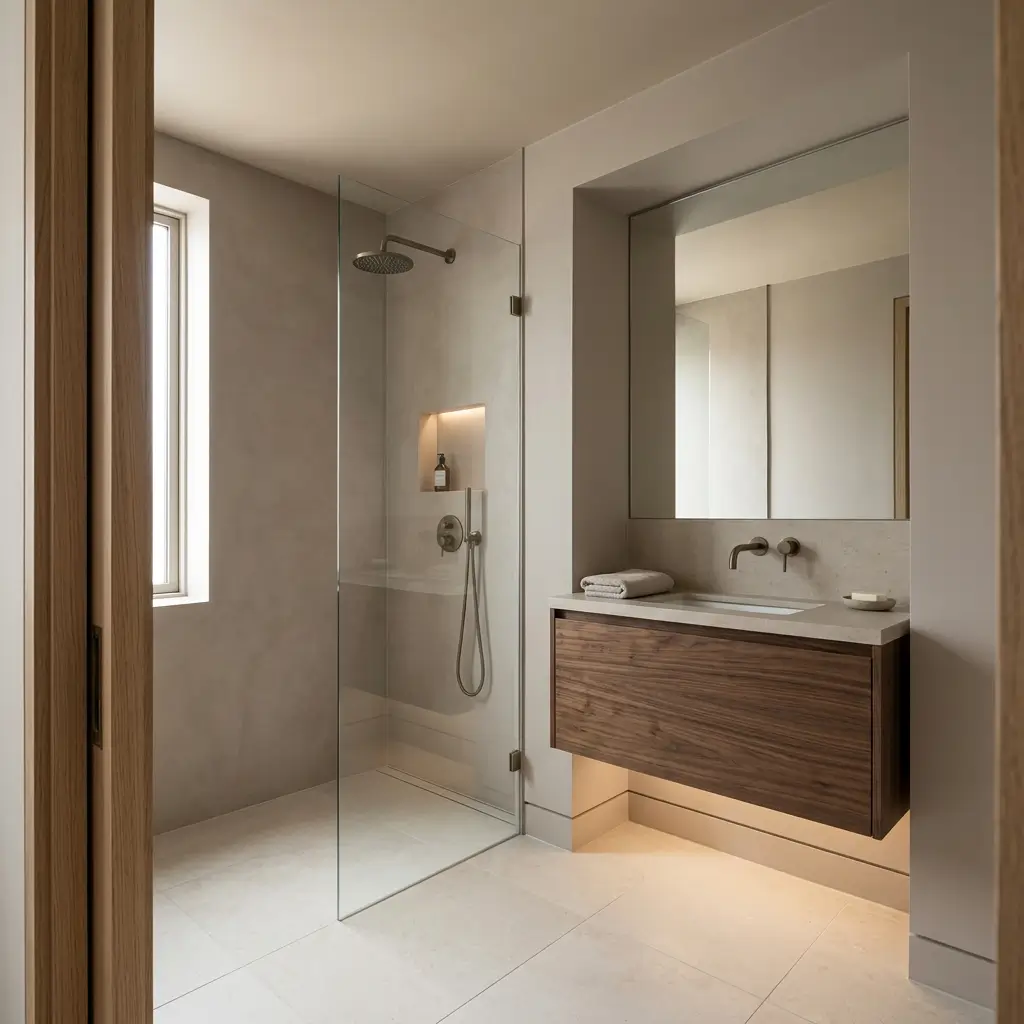
Contrast can be beautiful, but in a compact room it should be deliberate. Strongly contrasting walls, flooring, trim, cabinetry, grout, and accessories can create numerous visual stopping points.
That does not mean a small bathroom needs to be monochromatic. Instead, choose one dominant color family and introduce contrast through a few carefully selected elements.
For example, pale mushroom walls, ivory tile, and a dark walnut vanity can feel considerably more spacious than a bathroom with five unrelated colors, even though the second scheme may contain more visual interest individually.
The goal is not fewer colors at all costs. It is fewer competing visual boundaries.
Cohesive Palettes for Compact Spaces
The most successful small bathroom color schemes usually rely on relationships between surfaces rather than one isolated paint color.
- Soft white + warm wood + brushed brass: Bright and welcoming, with natural wood providing warmth without overwhelming the light backdrop.
- Pale blue + white + light oak: Fresh and airy, particularly effective when daylight reaches the room.
- Sage green + cream + natural stone: Soft and organic, with enough color to avoid looking generic.
- Light greige + white + aged brass: Subtle contrast with warmth, especially suitable for bathrooms with mixed neutral finishes.
- Cream + taupe + warm wood: A cozy tonal palette that works well where stark white feels too cold.
- Blue-gray + soft white + chrome: Cleaner and cooler, with restrained contrast that suits contemporary bathrooms.
- Pale mushroom + ivory + dark wood accents: Earthy and sophisticated, using dark wood as a controlled visual anchor.
What If My Bathroom …?
Is Windowless
Artificial lighting becomes especially important because there is no daylight to balance the paint’s undertones. Soft whites, warm creams, and carefully chosen pale neutrals can work well, but always judge samples under the actual bathroom lighting.
Has Very Little Natural Light
Consider lighter colors with gentle warm or balanced undertones rather than assuming a cool white will automatically brighten the room. The wrong undertone can make weak light feel even flatter.
Has Low Ceilings
A wall and ceiling color that are close in value can reduce the visual interruption at the ceiling line. Keeping upper surfaces light can also help the room feel less compressed vertically.
Has Dark Flooring
You do not necessarily need to replace it. Balance the floor with lighter walls, a visually lighter vanity, and limited contrast above eye level. Repeating a small amount of the floor’s darker tone elsewhere can also make the scheme feel intentional.
Has Strongly Colored Tiles
Work with the existing tile rather than automatically fighting it. Choose a wall color that shares an undertone with the tile and keep surrounding finishes relatively quiet. This can make a bold tile feel integrated rather than visually dominant.
Frequently Asked Questions
What is the best color for a small bathroom?
There is no single best color for every small bathroom. The most successful choice usually has a restrained contrast level and helps create continuity between walls, tile, ceiling, and cabinetry.
Does painting a small bathroom white make it look bigger?
White can make a small bathroom feel brighter and more open because it can reflect available light and reduce visual contrast. However, the result depends on the particular white and the room’s lighting.
Should a small bathroom have the same color on the walls and ceiling?
The walls and ceiling do not have to be identical, but keeping them close in color can be useful, especially with a low ceiling. A reduced contrast between the two surfaces makes the boundary less prominent.
Do dark colors make a small bathroom look smaller?
Not necessarily. Dark colors can add depth and character when used selectively. The problem is more likely to arise when a deep color covers large areas and is combined with several other high-contrast finishes in a poorly lit room.
The Bottom Line
So, which colors make a bathroom look bigger? There isn’t one shade that works for every small bathroom. In a bright room, a soft color can help maintain that airy feeling, while a warmer or more carefully chosen neutral can be more successful when natural light is scarce.
What matters is how the color relates to the light and the surfaces around it.
The most convincing results usually come when the bathroom doesn’t feel divided into too many separate color blocks. Keeping the walls, tile, and ceiling relatively harmonious can make the room’s boundaries less noticeable, which creates a stronger sense of space.
You can still introduce contrast and personality; it simply needs to have a clear place in the overall scheme rather than making a small room feel visually busy.