Bedroom curtain color ideas are more than just style choices; they influence how your space feels, how much light enters, and even the mood you experience when you walk in.
The right curtain color can create a cozy sanctuary, a bright and airy retreat, or a bold statement that ties your decor together. While fabric and design matter, color often carries the most impact. Timeless curtain colors balance beauty and practicality.
In this guide, we’ll explore 15 bedroom curtain color ideas that go beyond passing trends, helping you design a space that’s both stylish and enduring.
1. Classic White and Off-White Curtains

White and off-white curtains are timeless for a reason: they create an instant sense of freshness and openness. These light tones reflect natural light beautifully, making small bedrooms feel larger and brighter.
They also blend seamlessly with nearly any wall color, from bold navy to soft beige, ensuring long-lasting versatility. If you prefer a layered look, combine sheer white curtains with slightly heavier off-white panels. This subtle contrast adds depth without straying from the minimalist elegance.
To prevent a sterile feel, pair with natural wood furniture or warm metallic accents, which bring balance and warmth to the overall design.

2. Soft Neutrals: Beige, Taupe, and Greige
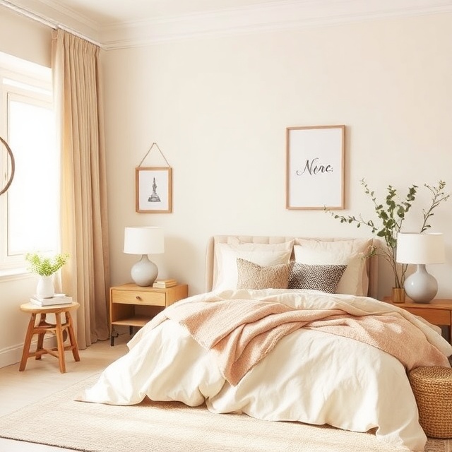
Neutral shades like beige, taupe, and greige offer understated elegance. They’re adaptable enough to pair with bold bedding or colorful accent walls while still maintaining a calming backdrop. These colors evoke a sense of groundedness, making them especially suitable for bedrooms designed for relaxation.
Layering different neutral shades—for example, taupe curtains against a cream wall—creates subtle dimension. To prevent the space from feeling flat, mix in varied textures such as linen or cotton blends. This combination strikes the perfect balance between modern simplicity and timeless comfort.
3. Neutral Gray Curtains
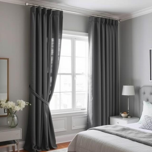
Gray has become a modern staple, thanks to its versatility and ability to balance warm and cool palettes. Light grays introduce softness, while darker tones like charcoal or slate add drama and sophistication. Gray curtains also act as a neutral anchor, allowing other elements like artwork or rugs to shine.
To elevate the look, use metallic tiebacks or rods in brushed nickel or chrome. This pairing reinforces the sleek, modern vibe without overwhelming the space. Gray’s neutrality ensures that even as you update other décor pieces, your curtains will remain relevant.
4. Elegant Blackout Dark Curtains

Dark curtains in colors like navy, charcoal, or deep black offer both functionality and drama. They create a cocoon-like environment, perfect for restful sleep while doubling as stylish focal points. When drawn, they eliminate external light and noise distractions, making them essential for city apartments or bright urban spaces.
To keep the mood inviting rather than heavy, pair dark curtains with lighter walls or furniture. Accents like crisp white bedding or a pale area rug ensure the balance feels deliberate. This combination provides privacy and elegance while supporting better rest.
5. Velvet Jewel Tones: Emerald, Sapphire, and Burgundy

Rich jewel tones such as emerald green, sapphire blue, and burgundy exude luxury. When rendered in velvet, these shades add depth and tactile richness, instantly elevating the room’s atmosphere. They work especially well in master bedrooms, where comfort and style go hand in hand.
Because jewel tones are bold, pair them with understated decor; muted wall paint, minimal patterns, and metallic accents. The curtains will naturally command attention, turning your windows into striking focal points without overwhelming the rest of the room.
6. Warm Earth Tones: Terracotta, Cinnamon, and Brown
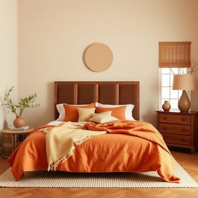
Earthy shades bring warmth and grounding energy to a bedroom. Terracotta and cinnamon hues create a cozy, rustic feel, while deeper browns add richness and sophistication. These colors work particularly well with natural materials like rattan, jute, or reclaimed wood furniture.
To modernize earth tones, consider pairing them with neutral walls in beige or cream. Add subtle greenery to connect the space with nature. This palette creates a harmonious environment that feels both inviting and timeless.
7. Muted Greens: Sage, Olive, and Moss
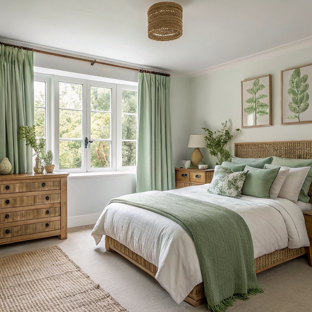
Muted greens like sage, olive, and moss evoke tranquility and a sense of nature indoors. These shades are ideal for bedrooms that aim to be restful retreats. Their natural undertones blend easily with wooden furniture, woven textures, and earthy décor accents.
To avoid a dull finish, pair muted green curtains with crisp white bedding or pale walls. This balance brightens the overall look while preserving the calming influence of the green tones. The result is a bedroom that feels fresh yet soothing.
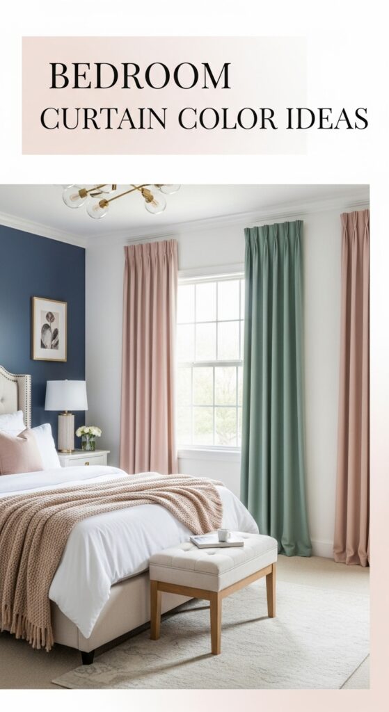
8. Soft Pastels: Blush, Lavender, and Mint
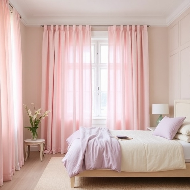
Pastel curtains bring a gentle, romantic atmosphere to the bedroom. Blush pink adds warmth without being overwhelming, lavender offers subtle elegance, and mint green feels fresh and cheerful. These shades are especially suitable for feminine, airy interiors.
Pair pastels with neutral walls and light-toned furniture for a cohesive palette. To avoid an overly youthful feel, ground the look with textured fabrics such as linen or cotton. This ensures the room maintains sophistication while embracing soft, uplifting colors.
9. Bold Contrasts: Black and White

For a modern, high-impact look, black and white curtains offer sharp contrast and graphic appeal. They can appear as solid panels, color blocks, or stripes, depending on your preference. The strong interplay of dark and light energizes the room while maintaining timeless simplicity.
Balance is key—too much contrast can overwhelm the space. Keep surrounding décor minimal and stick to a limited color palette in bedding and accessories. This allows the curtains to remain the standout feature without disrupting the room’s harmony.
10. Golden Hues: Champagne, Gold, and Warm Metallics

Warm metallic shades like champagne, muted gold, and bronze lend understated glamour. They reflect both natural and artificial light, creating a soft glow that enhances the room’s ambiance. These colors pair especially well with luxurious fabrics like silk or satin.
To maintain elegance, keep metallics subtle – opt for muted finishes rather than overly shiny ones. Pairing golden hues with neutrals like ivory or gray ensures the room feels sophisticated rather than flashy.
11. Cool Blues: Sky, Powder, and Steel Blue
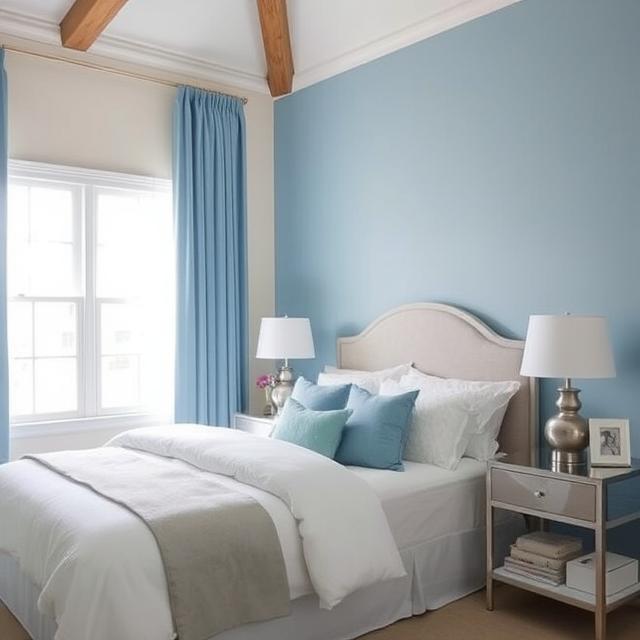
Blue curtains bring calmness and serenity to a bedroom. Lighter shades like sky and powder blue feel airy and fresh, while steel blue offers depth without being too dark. These hues are perfect for coastal-inspired or minimalist spaces.
Pair cool blues with crisp white bedding or natural wood furniture for a soothing contrast. Adding silver or chrome accents further enhances the refreshing, modern vibe. The overall effect is tranquil yet stylish.
12. Nature-Inspired Prints and Greens

Botanical or leafy prints in green tones connect the bedroom with nature. These designs can be subtle, like muted vines, or bold, like oversized tropical leaves. Either way, they bring freshness and vitality to the room.
When using patterned curtains, keep walls and bedding simple to avoid visual clutter. Pairing them with neutral walls allows the nature-inspired prints to stand out as the room’s focal point.
13. Layered Neutrals: Cream and Taupe, Gray and White
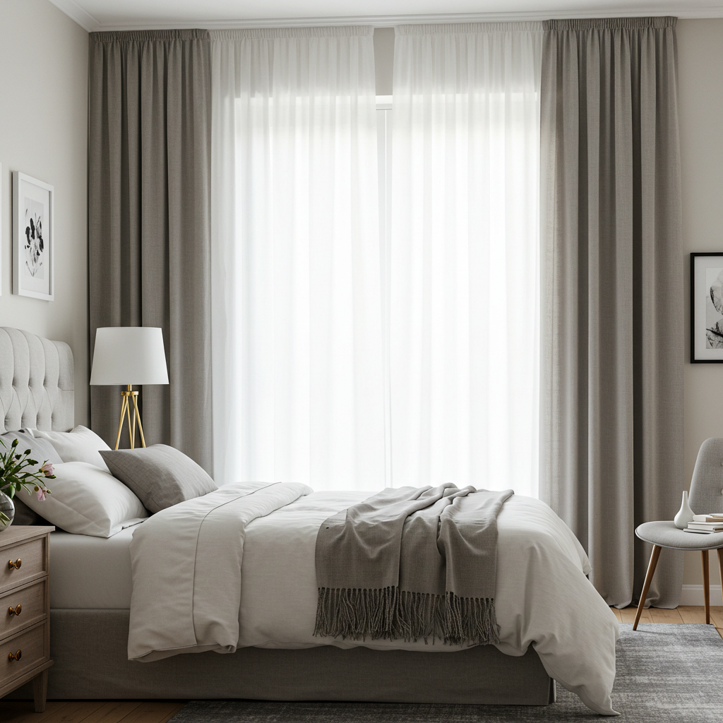
Layering curtains in complementary neutrals creates depth and texture without introducing bold colors. For example, combining sheer cream curtains with taupe panels adds warmth, while pairing white sheers with gray panels creates crisp sophistication.
This layered approach also allows flexibility; draw sheers for filtered light during the day and panels for privacy at night. It’s a practical yet stylish solution that works across modern and classic bedroom designs.
14. Rustic Reds and Deep Oranges
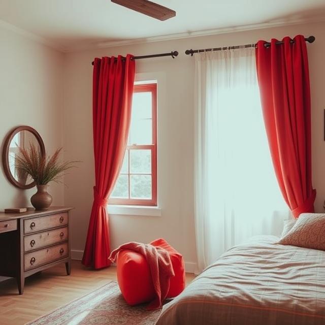
Warm reds and oranges evoke passion and coziness, making them excellent for bedrooms with rustic or bohemian themes. These shades add energy while still maintaining warmth.
To keep the look refined, balance vibrant curtains with muted walls in cream, beige, or gray. Incorporating natural textures like wood or stone prevents the colors from feeling overpowering while reinforcing a grounded, inviting ambiance.
15. Monochrome Shades: Tonal Layers of the Same Color

A monochrome palette uses varying shades of the same color family, such as light gray, medium gray, and charcoal. This creates a cohesive look while still offering depth. The tonal layering effect feels modern and designer-inspired.
To achieve balance, vary textures rather than introducing new colors. For example, pair linen sheers with velvet panels in different shades of blue. This ensures the room feels cohesive without becoming monotonous.
How to Choose the Right Curtain Color for Your Bedroom
Choosing the right curtain color goes beyond following trends. Here are a few guiding principles:
- Match or Complement Wall Colors: Curtains should either blend with wall colors for a seamless look or contrast tastefully for emphasis.
- Consider Natural Light: Lighter curtains maximize brightness, while darker shades help control light in sunny rooms.
- Think About Room Size: Lighter colors expand space, while darker tones add intimacy.
- Balance with Décor: Curtain colors should harmonize with bedding, rugs, and furniture.
- Seasonal Flexibility: A neutral base with swappable colorful accents keeps the room fresh year-round.
By applying these principles, your curtain choice won’t just be stylish—it will be practical and timeless.
FAQs About Bedroom Curtain Color Ideas
Q1. What color curtains are best for a small bedroom?
Light shades like white, ivory, or pastels make a small bedroom appear more spacious and airy.
Q2. Which curtain colors make a room look bigger?
Neutrals and lighter tones such as beige, soft gray, or light blue create the illusion of more space.
Q3. Should curtains be lighter or darker than walls?
Curtains can be either, but lighter curtains blend seamlessly while darker curtains add contrast and depth.
Q4. What are the most relaxing curtain colors for sleep?
Muted shades like sage green, lavender, and navy are calming choices that promote better rest.
Final Thoughts
Curtains are more than just functional accessories; they’re design statements that shape your bedroom’s personality. From classic neutrals to bold jewel tones, the right curtain color sets the mood, balances your décor, and enhances your comfort.
By exploring these 15 bedroom curtain color ideas, you can transform your space into a sanctuary that feels both stylish and personal.
Whether you lean toward calming pastels, earthy tones, or dramatic contrasts, remember that curtain colors influence not just how your room looks but how it makes you feel. Choose wisely, and your bedroom will always welcome you with comfort and beauty.