Selecting the perfect hue for a home is often where the excitement of a renovation meets the friction of indecision. We have all stood before a wall of paint swatches, paralyzed by the subtle differences between “Alabaster” and “Cloud.”
The challenge isn’t a lack of options, but rather the difficulty of visualizing how those tones will interact with light, furniture, and the architecture of a room.
A well-constructed palette does more than just cover the walls; it establishes a rhythmic flow that tethers disparate rooms together into a cohesive narrative.
In this collection of modern color palette guides, we move away from the rigid rules of traditional color theory and toward a more intuitive, lifestyle-driven approach. Modern design isn’t defined by a single color but by the intentional balance of contrast, texture, and saturation.
Whether you are looking to create a high-contrast sanctuary or a soft, monochromatic retreat, these curated combinations provide the foundation for a home that feels both current and timeless.
1. The Organic Minimalist: Sage and Warm Cream
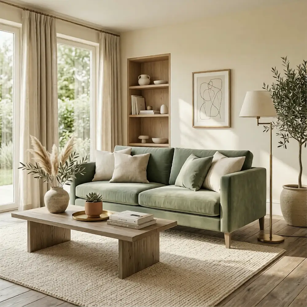
There is a profound sense of quietude in a palette that draws directly from the natural world. By pairing a muted sage green with a rich, warm cream, you bridge the gap between clinical modernism and organic comfort.
This combination feels modern because it avoids the starkness of pure white, opting instead for a “lived-in” brightness that feels expensive and intentional. This palette shines in sun-drenched living rooms or airy kitchens.
The primary sage acts as a grounding force, while the cream keeps the space feeling expansive. To add depth, incorporate accents of weathered oak and antique brass. The metallic sheen of the brass provides a sharp, contemporary edge against the softness of the matte walls.
Styling Tip: Use the warm cream for your largest surfaces—walls and cabinetry—and reserve the sage for a velvet sofa or a kitchen island to create a sophisticated focal point.
2. Urban Contrast: Charcoal, Light Oak, and Slate
High-contrast interiors often lean toward the dramatic, but the secret to making them feel modern is the introduction of natural wood. Charcoal gray provides a moody, architectural backdrop, while light oak elements prevent the room from feeling heavy or cold.
It is a study in the balance of industrial strength and Scandinavian warmth. This scheme is particularly effective in a home office or a primary bedroom where you want to foster focus and serenity.
The primary charcoal creates a sense of enclosure, while the secondary light oak provides a visual “breath.” Accents of slate blue and cool white round out the look.
Styling Tip: To keep charcoal from feeling flat, prioritize texture. A charcoal-colored linen bedding set or a wool rug will catch the light differently than a flat painted wall, adding necessary dimension.
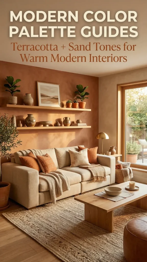
3. The New Mediterranean: Terracotta and Sand
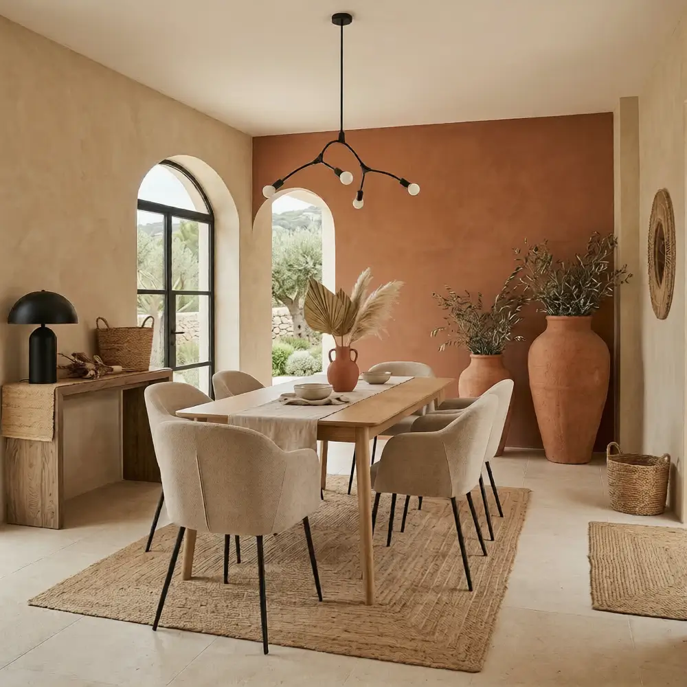
Moving away from the cool grays that dominated the last decade, we are seeing a shift toward “sun-baked” neutrals. A palette of terracotta and sand tones feels modern because it prioritizes tactile warmth.
It’s a sophisticated take on earthy living that feels more like a boutique hotel in Ibiza than a rustic farmhouse. In a dining room or an entryway, this palette creates an immediate sense of welcome. The primary sand tone keeps the space bright, while the secondary terracotta adds a rhythmic pulse of color.
Accent this with matte black hardware and dried botanical textures like raffia or jute.
Styling Tip: Treat terracotta as your “bold” neutral. Use it on a single accent wall or in large-scale ceramic floor vases to anchor the sand-colored surroundings.
4. Coastal Refinement: Dusty Blue and Soft Gray
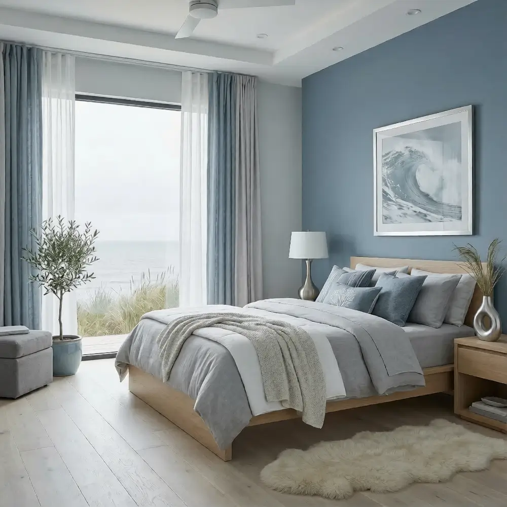
Blue is a perennial favorite, but the modern iteration favors desaturated, “dusty” versions over bright navies or sky blues. When paired with a soft, misty gray, the result is a sophisticated coastal vibe that feels airy without being cliché.
It captures the light of an overcast morning, providing a serene backdrop for modern life.
This combination is a natural fit for bedrooms and bathrooms. The primary dusty blue provides a calming influence, while the secondary soft gray ensures the space remains neutral enough for various furniture styles. Incorporate accents of cool silver and crisp white to maintain a clean, polished finish.
Styling Tip: To prevent this palette from feeling “chilly,” introduce warmth through textiles like a chunky knit throw or a light-colored sheepskin rug.
5. The Monochromatic Noir: Black, White, and Natural Oak
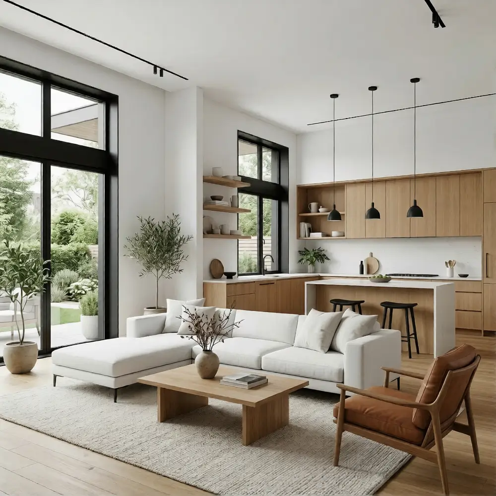
The black-and-white interior is a classic, but the modern version relies heavily on the “third element”: natural texture. Without the warmth of wood or stone, a black-and-white room can feel two-dimensional.
By using black as a sharp architectural line against white walls and softening the blow with natural oak, you achieve a high-fashion look that remains livable. This is a powerhouse palette for open-concept living areas and modern kitchens.
The primary white keeps the floor plan feeling massive, while secondary black accents (like window frames or lighting fixtures) provide definition. Accents of cognac leather and potted greenery bring the space to life.
Styling Tip: Follow the 70/20/10 rule here. Use white for 70% of the space, wood tones for 20%, and reserve black for the final 10% of high-impact details.
6. Botanical Sophistication: Olive Green and Linen Beige
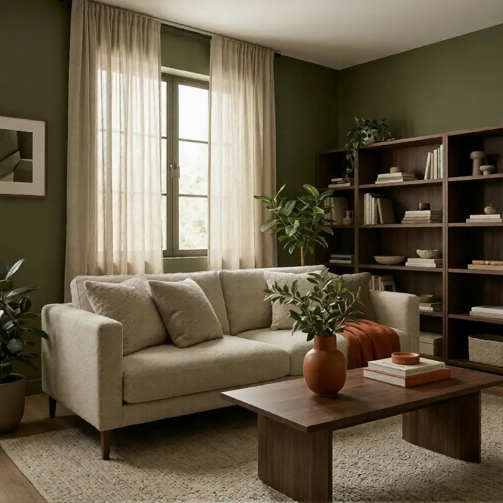
Olive green has emerged as the “new neutral” for those who want color without the commitment of a bright hue. It is sophisticated, timeless, and pairs beautifully with the textured look of linen beige.
This palette feels modern because it is grounded in the “biophilic” design movement, which seeks to bring the outdoors in. Use this in a den or a library to create a cozy, cocoon-like atmosphere.
The primary olive green serves as a rich, velvet-like base, while the secondary linen beige provides a light, breathable contrast. Accent the room with dark walnut and burnt orange for a subtle nod to mid-century modern aesthetics.
Styling Tip: Olive green looks best in a matte or eggshell finish. Avoid high-gloss paints with this color, as they can look overly traditional rather than modern.
7. The Midnight Retreat: Deep Navy and Polished Brass
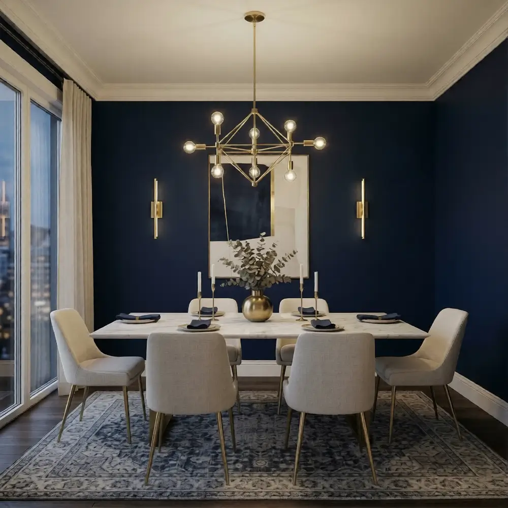
For a space that feels curated and slightly nocturnal, deep navy remains a top choice. In a modern context, we pair navy with polished brass and off-white to keep it from feeling like a traditional maritime theme. The navy acts as a dark neutral, providing a deep “void” that allows metallic accents to pop.
This is an ideal palette for a formal dining room or a powder room. The primary navy creates a sense of luxury, while the secondary off-white (on ceilings or trim) provides necessary contrast. Use polished brass and marble as your accent materials to elevate the sophistication.
Styling Tip: Lighting is crucial with navy. Use layered lighting – lamps, sconces, and dimmers—to ensure the dark walls glow rather than disappear into shadows.
8. Scandinavian Sunset: Warm Taupe and Soft Blush
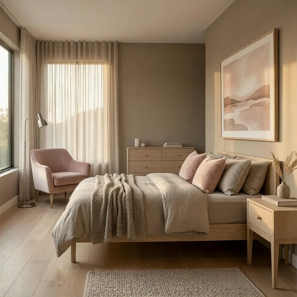
Blush has outgrown its “nursery” reputation and matured into a sophisticated accent for warm taupe. This palette is incredibly flattering to human skin tones and makes any room feel bathed in the “golden hour” light.
It is a modern choice for those who want a space that feels soft, feminine, and architectural all at once. This works beautifully in a dressing room, a lounge, or a guest bedroom. The primary warm taupe provides a solid, earthy foundation, while the secondary blush adds a layer of ethereal light.
Styling Tip: Keep the blush subtle. Use it in pillows, artwork, or a single velvet armchair rather than painting all four walls, which can become overwhelming.
9. Industrial Earth: Clay and Off-White
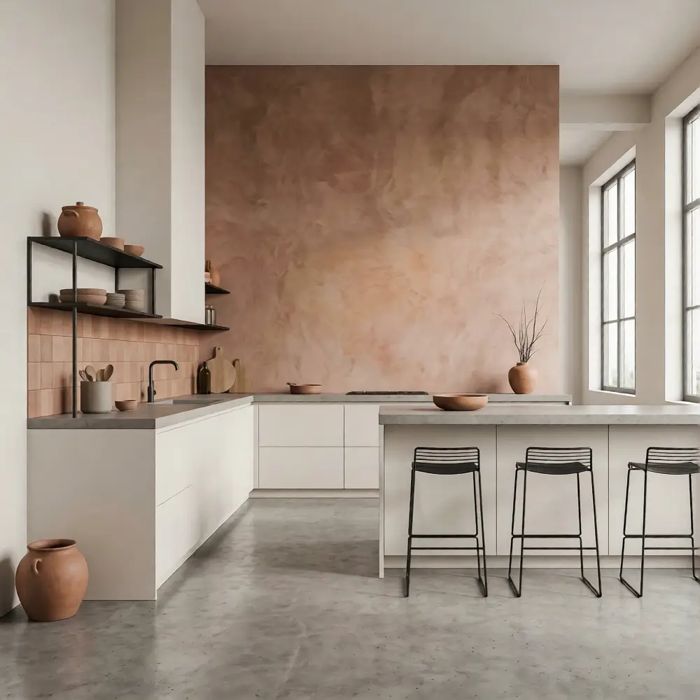
Clay tones – somewhere between pink, brown, and orange offer a modern take on industrial warmth. When paired with a stark off-white, the clay feels contemporary and sculptural. It’s a palette that celebrates raw materials and unrefined beauty.
This combination is perfect for a modern loft or a minimalist kitchen. The primary off-white keeps the space feeling “gallery-like,” while the secondary clay adds a sense of craft and history. Accents of concrete and black steel provide the industrial grit needed to balance the warmth of the clay.
Styling Tip: Use clay-colored tiles or a plaster wall finish to introduce a sense of “hand-applied” texture that complements the flat off-white surfaces.
10. The Forest Sanctuary: Forest Green and Natural Stone
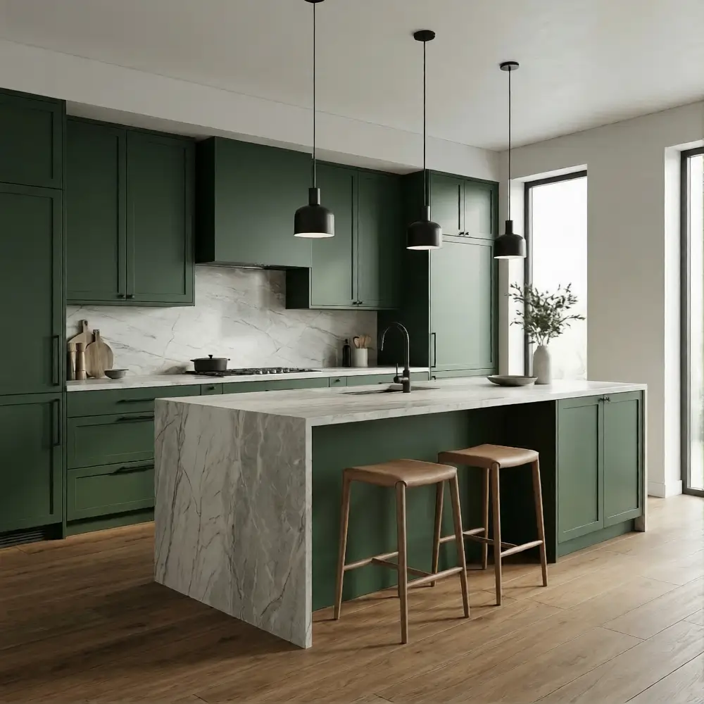
Deep forest green is a power color that brings a sense of gravity to a room. When paired with the cool, variegated tones of natural stone – like light marble or grey limestone – the result is a high-end, modern sanctuary. It feels like a contemporary cabin tucked away in the woods.
This palette is exceptional for kitchens (think forest green cabinetry with stone countertops) or bathrooms. The primary green provides a lush, saturated backdrop, while the secondary stone adds a tactile, cooling element.
Styling Tip: If using forest green on the walls, ensure you have plenty of natural light. In darker rooms, keep the green to the lower half of the walls (wainscoting) to prevent the space from feeling too small.
Quick Tips for Choosing a Modern Color Palette
- Start with a neutral base: Use a neutral (white, beige, or gray) for 60% of the room to allow your accent colors to shine.
- Limit the palette to 3–5 tones: Modern design thrives on restraint. Too many colors create visual “noise.”
- Balance warm and cool shades: If your walls are a cool blue, use warm wood furniture to keep the space inviting.
- Use texture to soften bold colors: A dark wall feels less intimidating when paired with soft fabrics like wool, velvet, or linen.
FAQ
Q1. What colors are considered modern in interior design?
Modern colors typically include desaturated “earth” tones like sage, terracotta, and clay, alongside classic high-contrast pairings like charcoal and light wood. The “modern” aspect often comes from the finish (matte rather than gloss) and the balance of the tones.
Q2. How many colors should a modern palette include?
A successful modern palette usually consists of 3 to 5 colors. This typically includes one primary wall color, one secondary color for larger furniture or rugs, and two to three accent tones for smaller décor items.
Q3. Can bold colors work in modern spaces?
Absolutely. Bold colors work best in modern spaces when they are used “architecturally” – for example, a forest green kitchen island or a navy accent wall – and balanced with plenty of neutral space to let the color breathe.
Conclusion
Ultimately, the best modern color palette guides are those that reflect your personal rhythm. Colors are the most subjective tool in a designer’s kit; they have the power to alter your mood the moment you cross the threshold.
By focusing on a limited selection of tones and emphasizing the relationship between light and texture, you can move past the overwhelming array of swatches and create a home that feels curated, balanced, and uniquely yours.