Selecting window treatments is often the final step in designing a bedroom, yet it has a disproportionate impact on how the room feels. The fabric framing your window does more than block streetlights or provide privacy; it sets the emotional tone for the space where you start and end your day.
A heavy, dark drape can make a room feel cozy and enclosed, while a light, breezy shear can make a cramped corner feel expansive. Navigating the endless swatch books at a fabric store can be overwhelming.
Homeowners often struggle to visualize how a small square of color will look when it hangs floor-to-ceiling across a wall. The fear of making a mistake often leads people to settle for generic options that don’t quite elevate the room.
However, finding the right shade is less about following trends and more about understanding the light and mood of your specific space.
This guide explores a range of practical bedroom curtain color ideas designed to suit various aesthetics, from modern minimalism to traditional warmth. whether you are looking to create a dark cave for deep sleep or a sun-drenched morning retreat, these suggestions will help you make a confident decision that balances style with function.
1. Classic White for an Airy Atmosphere
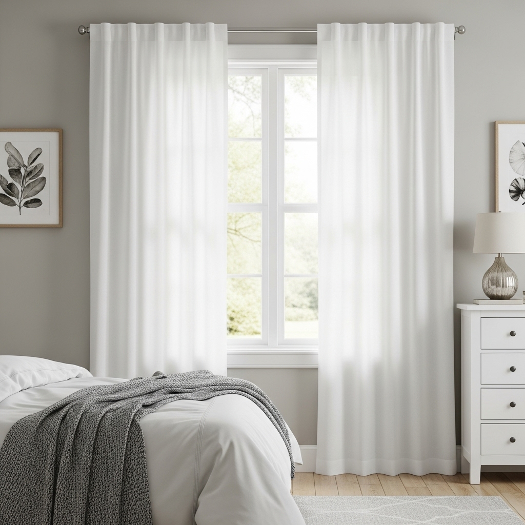
White curtains remain the gold standard for a reason. They offer an unmatched ability to brighten a room by reflecting natural light into every corner. A crisp white panel acts as a diffuser, softening the harsh glare of direct sunlight into a gentle, ambient glow that flatters the rest of the décor.
This choice is particularly effective in smaller bedrooms or spaces with limited windows, where maintaining a sense of openness is a priority. The versatility of white allows it to blend seamlessly with any wall color or bedding pattern.
It serves as a palate cleanser for the eyes, providing a quiet backdrop that lets other design elements, like a statement headboard or artwork, take center stage. To avoid a sterile or hospital-like feel, look for fabrics with texture.
A slubbed linen or a heavy cotton twill adds visual weight and warmth that a flat polyester sheet lacks. Maintenance is often the main concern with white fabrics, but modern stain-resistant blends have made this easier.
For those prioritizing sleep, ensure the panels are lined with a thick blackout material. This preserves the light, airy aesthetic on the interior while effectively blocking external light sources, giving you the visual freshness of white without sacrificing sleep quality.
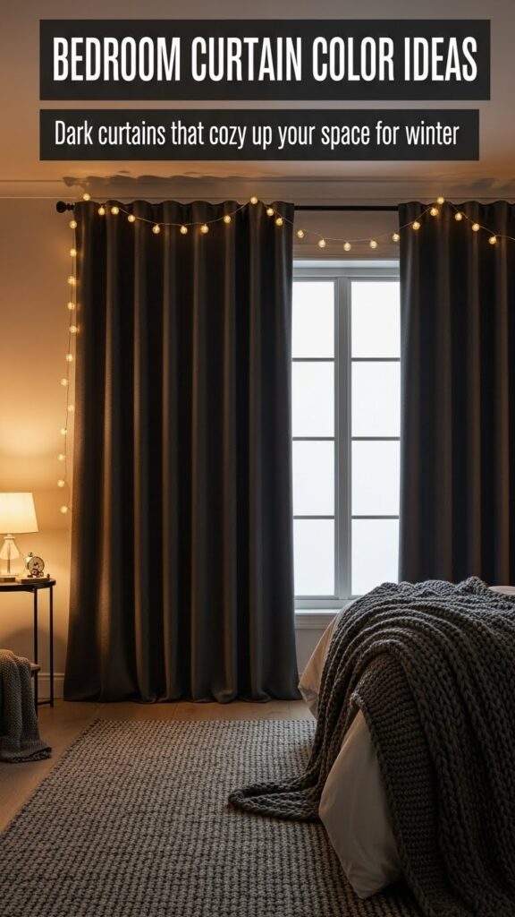
2. Charcoal Grey Adds Modern Depth
Charcoal grey offers a sophisticated alternative to black, providing depth and drama without the stark heaviness. This color grounds the room, creating a sense of stability and calm that is essential for a restful environment.
It works exceptionally well in contemporary or industrial-inspired spaces, where sleek lines and cool tones dominate. This shade is a chameleon, capable of looking warm or cool depending on the undertones and the lighting in the room.
A charcoal curtain against a light grey or white wall creates a striking high-contrast look that feels architectural and deliberate. It anchors the window, drawing the eye and defining the vertical space of the room. From a practical standpoint, dark grey is incredibly forgiving.
It hides dust, fingerprints, and minor wear far better than lighter shades, making it a smart choice for households with pets or children. When pairing charcoal drapes with other elements, consider matte metallic hardware in silver or black to maintain the modern, cohesive aesthetic.
3. Soft Sage Green Promotes Tranquility
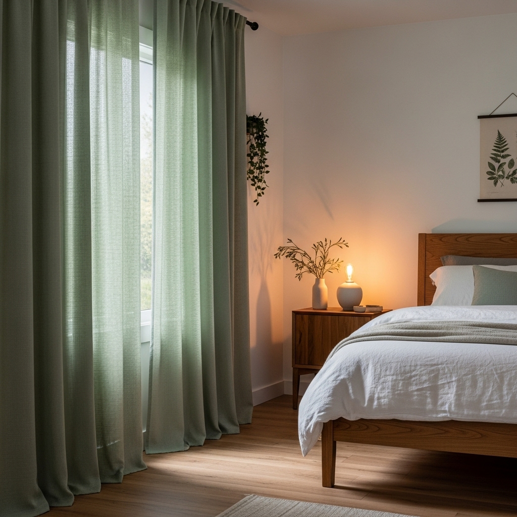
Bringing elements of nature into the bedroom is a proven strategy for reducing stress, and sage green is the perfect vehicle for this biophilic approach. This muted, earthy tone sits comfortably between green and grey, acting as a colored neutral.
It evokes the quiet stillness of a garden or forest, fostering a connection to the outdoors that encourages relaxation. Sage works beautifully alongside natural materials. It complements warm wood furniture; from oak to walnut and looks stunning against hardwood floors.
The green tones highlight the richness of the grain, creating a harmonious, organic palette. It is subtle enough to fade into the background but interesting enough to prevent the room from feeling flat. This color is also versatile regarding light filtration.
It is generally dark enough to offer a sense of privacy and enclosure when drawn, yet light enough to keep the room feeling fresh during the day. Pair it with botanical prints or simple linen bedding to reinforce a serene, spa-like atmosphere that feels restorative.
4. Deep Navy Blue for Timeless Elegance
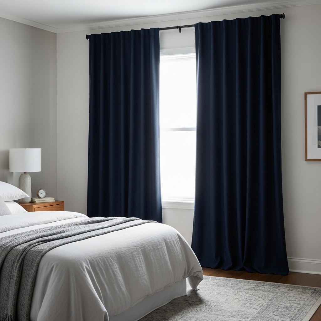
Navy blue commands attention while exuding a sense of classic luxury. Often referred to as a “new neutral,” it pairs effortlessly with a wide range of colors but brings a significantly bolder presence than beige or grey. In a bedroom setting, navy curtains create a cozy, cocoon-like effect that feels protective and intimate.
The deep saturation of navy fabric is excellent for light control. Even without a heavy industrial liner, the dark pigment absorbs a significant amount of light, naturally aiding in darkening the room for sleep.
This makes it an ideal choice for light sleepers or shift workers who need to create a nighttime environment during the day.
Styling navy requires balance to ensure the room doesn’t feel too heavy. It looks crisp and nautical when paired with white walls and trim, but can also take on a moody, romantic vibe when set against dark grey or even black walls.
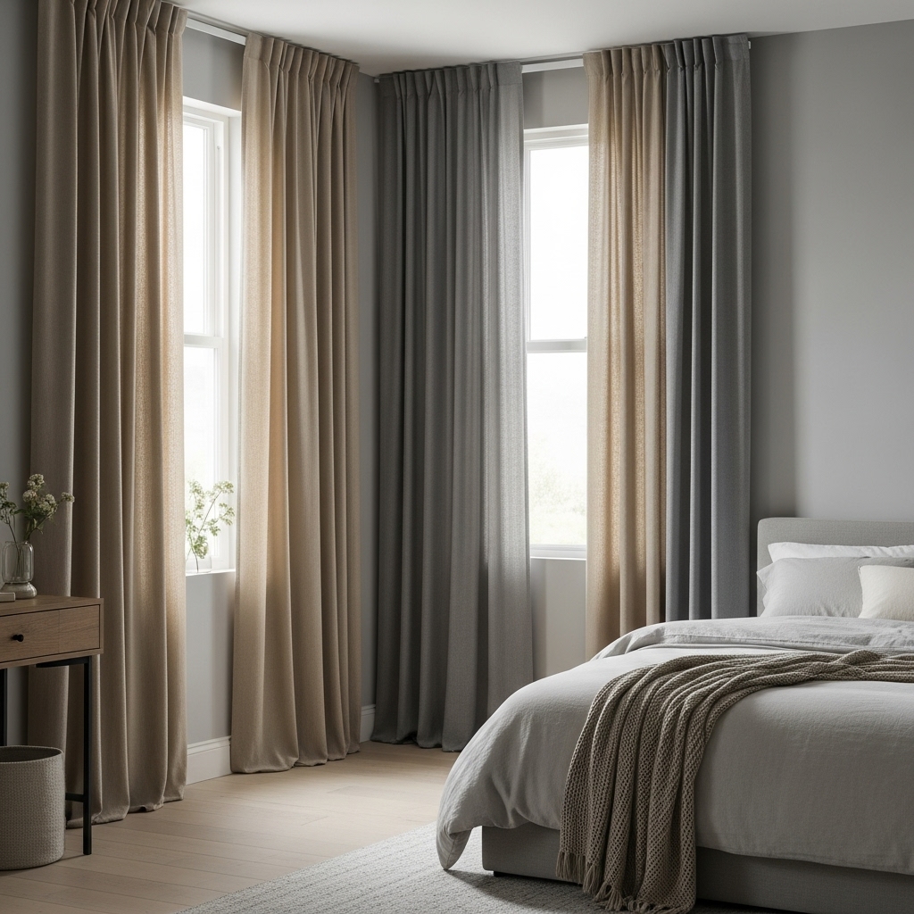
5. Warm Oatmeal and Beige
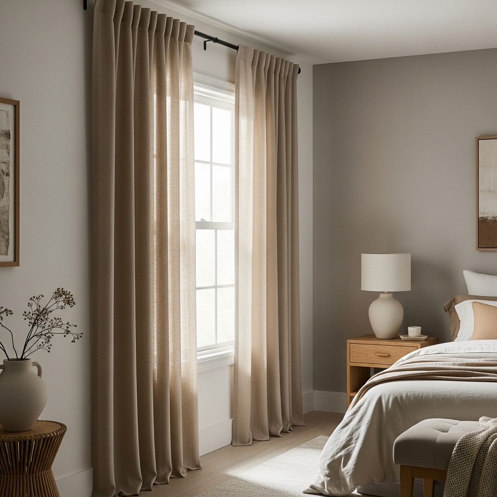
If white feels too cold and grey feels too industrial, warm oatmeal or beige is the ideal middle ground. These sandy, earth-toned hues bring immediate warmth to a bedroom, making the space feel inviting and lived-in.
Modern oatmeal shades have moved away from the yellow-based beiges of the past, offering complex, nutty undertones that look sophisticated and expensive. This color family excels at softening the architectural lines of a room.
It blurs the harsh edges of a window frame and creates a gentle, fluid transition between the walls and the outdoors. It is particularly effective in monochromatic schemes where texture does the heavy lifting. Layering different shades of cream, sand, and taupe creates a rich, tactile environment.
Beige curtains offer incredible longevity. You can completely change your accent colors; swapping a duvet from terracotta to olive green; and your window treatments will likely still harmonize perfectly. This adaptability makes them a prudent investment for homeowners who enjoy refreshing their décor seasonally without the expense of buying new drapes.
6. Dusty Pink or Blush for Softness
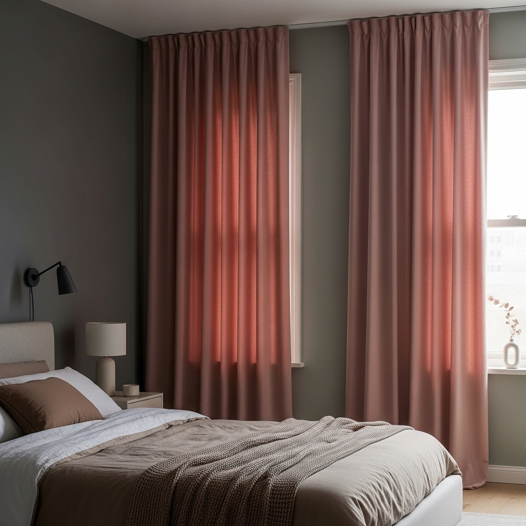
Pink has graduated from children’s rooms to become a sophisticated option for adult spaces. Dusty pink or blush offers a subtle flush of color that acts as a warm neutral, far removed from the aggressive brightness of hot pink.
It brings a sense of romance and softness to the environment, tempering harder edges and cooler tones. This shade is especially flattering in morning light, casting a warm, rosy glow into the room that can make waking up feel gentler.
It adds personality and warmth that standard neutrals cannot achieve, yet remains unobtrusive enough to not disrupt the peaceful vibe essential for a sleeping area. To keep the look mature, focus on the fabric weight and finish.
Avoid shiny satins or sheers; instead, opt for heavy velvet, washed linen, or matte cotton. A weighted blush curtain against a charcoal or sage green wall creates a high-contrast, designer look that feels current and chic rather than juvenile.
7. Mustard Yellow for Retro Warmth
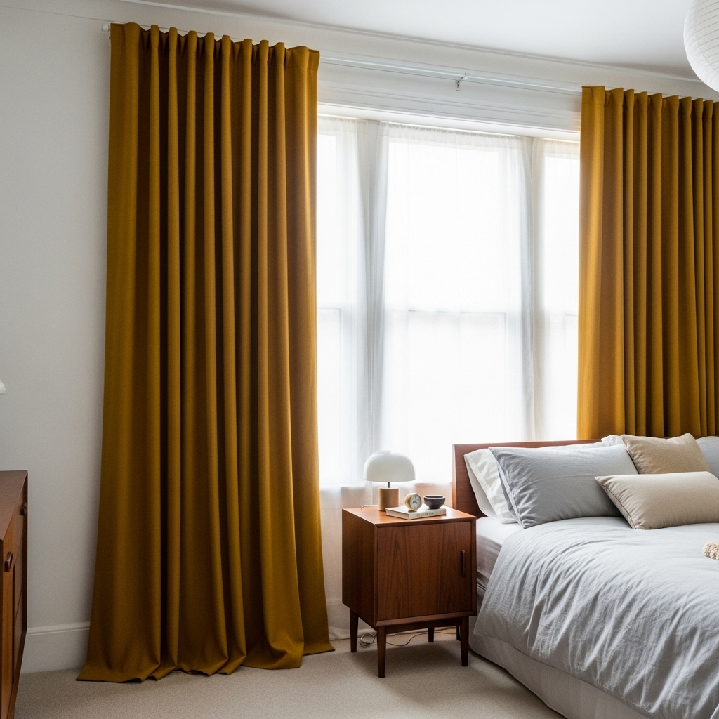
For those who find it difficult to wake up, mustard yellow injects a dose of energy and sunshine into the room. This isn’t a neon primary color; it is a rich, spicy ochre that feels vintage and earthy. It serves as a warm focal point, enlivening the space even on gray, cloudy days.
Mustard works beautifully as a singular accent in a room that is otherwise neutral. If you have white walls and grey bedding, adding these curtains brings instant character and warmth without overwhelming the senses.
It also pairs fantastically with mid-century modern furniture and dark wood tones, playing into a 1970s-inspired aesthetic. Because yellow naturally attracts the eye, this choice draws attention to the window architecture.
It is a great strategy if you have large windows or a pleasant view you wish to highlight. Balancing the energy is key; keep the rest of the room’s decor relatively simple so the curtains can shine as the primary feature without competing for attention.
8. Terracotta and Rust Tones
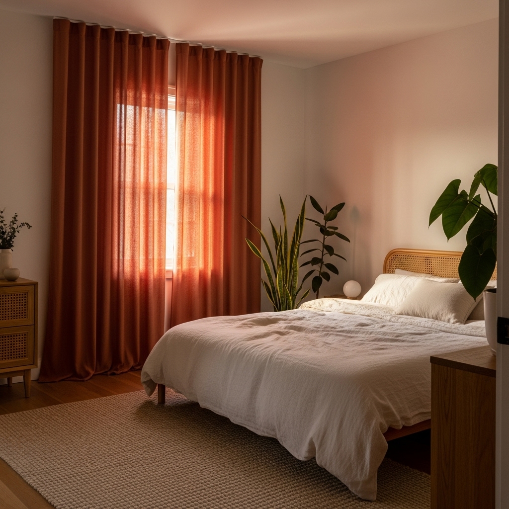
Earthy reddish-brown tones like terracotta, rust, and burnt orange have surged in popularity as homeowners seek to create grounded, cozy sanctuaries. These colors mimic natural clay and soil, providing a deep, comforting warmth that makes large or drafty bedrooms feel intimate.
They offer a perfect antidote to the starkness of minimalism.
Terracotta curtains glow beautifully when backlit by the sun, filling the room with ambient warmth that feels almost tangible. They pair exceptionally well with indoor plants, as the contrast between the rusty orange fabric and the green leaves creates a vibrant, natural palette that feels alive.
Texture plays a crucial role with this color. A flat sheet in rust can look dull, but a textured linen or velvet brings out the richness of the dye. This color creates a strong anchor in the room, so it works best when balanced with lighter rugs or bedding to prevent the space from feeling too dark or enclosed.
9. Tone-on-Tone Wall Matching
One of the most effective tricks for expanding the visual size of a bedroom is matching your curtain color exactly to your wall paint. This monochromatic approach creates a continuous visual line, erasing the boundary where the wall ends and the window begins.
Without the interruption of a contrasting color, the eye travels smoothly around the room, creating an illusion of spaciousness. This technique delivers an elegant, understated look. It adds texture and softness to the walls without introducing a new color variable to manage.
10. Moody Forest Green
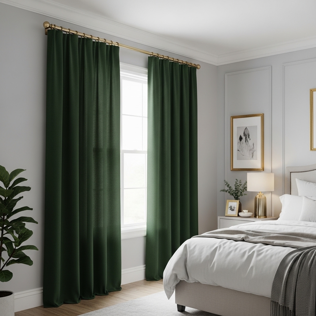
While sage acts as a neutral, forest green makes a statement. This deep, saturated hue brings the drama of the outdoors inside, enveloping the room in richness.
It feels traditional and studious, reminiscent of old libraries or country estates, yet it fits perfectly into modern homes looking for a touch of elegance and weight.
Forest green curtains are excellent for light control. The density of the color naturally absorbs light, making them a functional choice for those who need a dark sleeping environment. They look stunning against crisp white trim or pale grey walls, providing a high-contrast look that is timeless rather than trendy.
11. Cool Teal or Peacock Blue
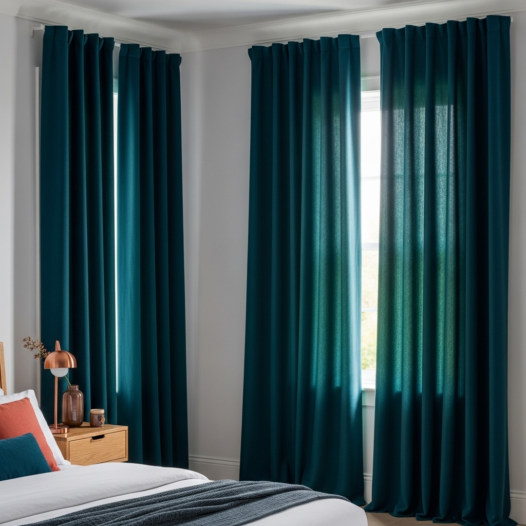
Teal sits confidently between blue and green, offering the calming properties of both with a jewel-toned richness. A dark teal or peacock blue curtain adds a layer of depth to the bedroom that feels exotic and unique.
It is a dynamic color that shifts with the light; appearing bluer in the morning and greener in the evening. This shade works wonders in rooms that feel a bit lifeless or generic, adding immediate personality.
Teal pairs beautifully with wood tones, from light oak to dark mahogany, and complements warm metallic finishes like copper or bronze. It bridges the gap between fun color and sophisticated darkness.
Because it is a strong color, it works best when the rest of the room is relatively neutral, or when paired with complementary colors like coral or mustard in small doses. It creates a cozy, enclosed feeling that is perfect for winding down at the end of the day, offering a distinct separation from the rest of the house.
12. Layered Sheer Cream
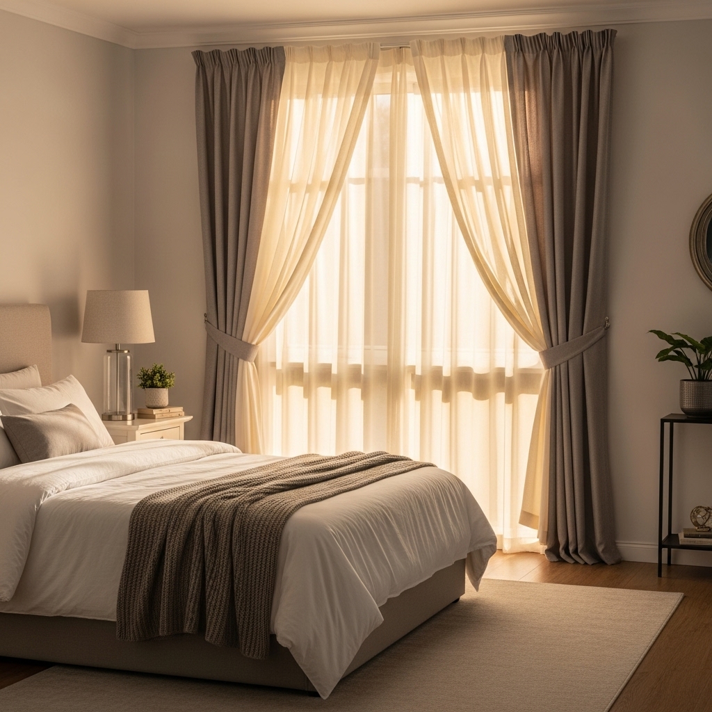
Sometimes the best approach is to focus on diffusion rather than color blocking. Cream sheers prioritize softness and light. They are ideal for bedrooms that do not suffer from streetlamp glare or for homeowners who enjoy waking up to natural sunlight.
The cream tone is warmer than white, casting a flattering, golden light into the room. Layering is where this idea truly shines. You might pair sheer cream curtains with heavier drapes for versatility, or use them on their own for a breezy, ethereal look.
This setup provides privacy during the day; you can see out, but neighbors cannot see in – while keeping the room feeling light and airy. This look is synonymous with resort-style living and suggests a relaxed pace of life.
If darkness is needed at night, consider installing a discrete blackout roller blind behind the sheers. This allows you to maintain the soft, romantic aesthetic of the cream fabric without sacrificing the functionality needed for deep sleep.
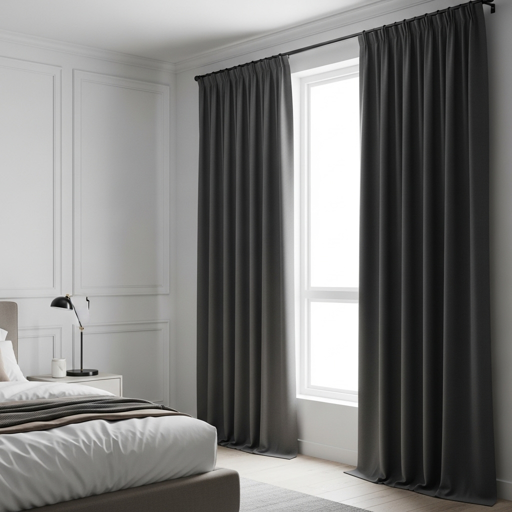
13. Black for Ultimate Contrast
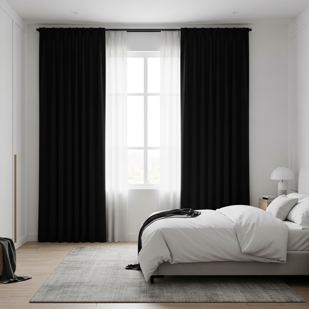
Black curtains are a bold design move that signals confidence and modernity. While some fear black will make a room look like a dungeon, when executed correctly, it creates a striking, graphic frame for your view.
It defines the window architecture sharply and provides the ultimate contrast in light-colored rooms. Functionally, even without heavy liners, black fabric absorbs significant amounts of light, making it a top contender for bedrooms where total darkness is required.
It eliminates visual distractions, allowing the eye to rest. To keep black curtains from feeling oppressive, ensure the fabric hangs well and touches the floor. High-quality velvet or heavy linen in black looks luxurious, whereas cheap polyester can look shiny and plastic.
Pair them with white walls and light bedding to create a classic monochrome palette that is chic and timeless.
14. Patterned Neutrals for Texture
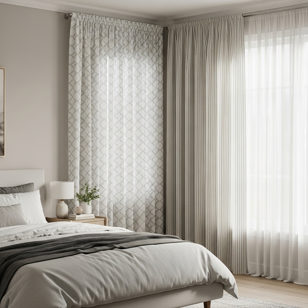
If solid colors feel too plain but bold prints feel too risky, patterned neutrals offer a perfect compromise. Think of a white curtain with a subtle grey geometric print, or a beige fabric with a thin charcoal pinstripe. These patterns add visual interest and movement to the room without introducing a loud color palette.
Patterned neutrals are excellent for hiding wrinkles and minor stains, making them practical for everyday life. They introduce a layer of complexity to the design scheme, making the room feel styled by a professional. The pattern draws the eye in, rewarding a closer look, but fades into a nice texture from a distance.
When mixing patterns, vary the scale to avoid chaos. If your bedding has a large floral print, choose curtains with a small, tight geometric pattern or a simple stripe. This keeps the room from feeling busy. It is a subtle way to add personality while keeping the overall vibe calm and conducive to sleep.
15. Two-Tone Color Blocking
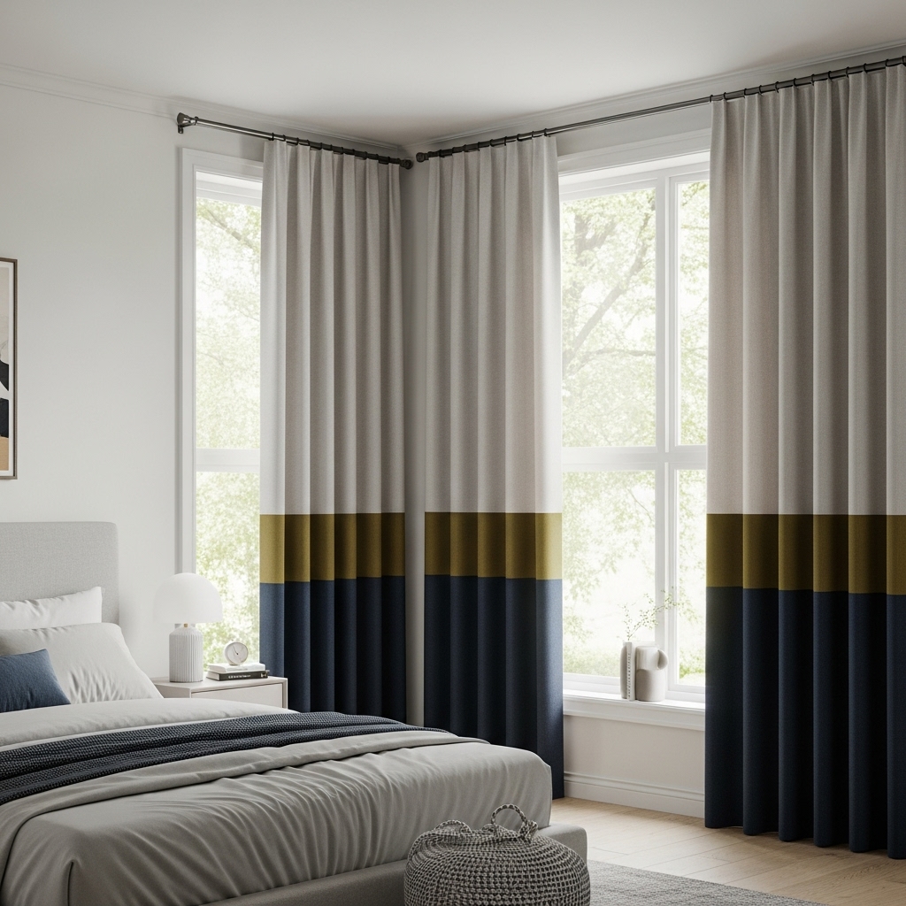
Color blocking is a clever visual trick that involves curtains with two distinct blocks of color; usually a neutral on the top two-thirds and a darker color on the bottom third.
This draws the eye upward, emphasizing the height of the ceiling, while the darker bottom section grounds the drapes and hides dirt where the fabric touches the floor. This style allows you to introduce a bold color, like navy, emerald, or mustard, without committing to a full floor-to-ceiling panel of it.
It feels modern, custom, and tailored. You can often find ready-made options, or you can achieve this look by adding a band of fabric to existing curtains. The horizontal line created by the color block can widen the look of the window, making the room feel more expansive.
Frequently Asked Questions
Q1. What curtain color is best for sleep?
Darker, cool-toned colors are generally best for sleep. Navy blue, charcoal grey, and forest green naturally absorb light and create a cave-like atmosphere that signals the brain it is time to rest. However, any color can work if lined with a high-quality blackout liner.
Q2. Should curtains match the wall color?
They do not have to match, but matching them creates a seamless, larger look for the room. If you want the curtains to stand out as a decor feature, choose a contrasting color. If you want them to blend in and make the room feel spacious, match the wall color.
Q3. Do light colored curtains block light?
Light colors reflect light rather than absorb it, so on their own, they are poor at blocking light. However, you can buy white or beige curtains with a “blackout” or “thermal” lining sewn into the back. This gives you the light aesthetic you want with the darkness you need.
Q4. How do I choose a color for a small bedroom?
Stick to light, airy colors like white, cream, or light grey to make a small bedroom feel open. Avoiding heavy, dark fabrics prevents the room from feeling boxy or claustrophobic. Hanging the curtains high and wide also helps trick the eye into seeing a larger space.
Conclusion
Selecting the perfect shade is less about strict design rules and more about how you want to feel when you wake up. Whether you lean toward the crispness of white or the moodiness of charcoal, your choice transforms the room’s energy instantly.
Don’t overthink the process. Order a few swatches, hang them up, and watch how they change with the light throughout the day. This simple step removes the guesswork and ensures you love the result.
Ultimately, the best bedroom curtain color ideas are the ones that help you relax. Trust your instinct, explore the options that catch your eye, and enjoy finishing your sanctuary.